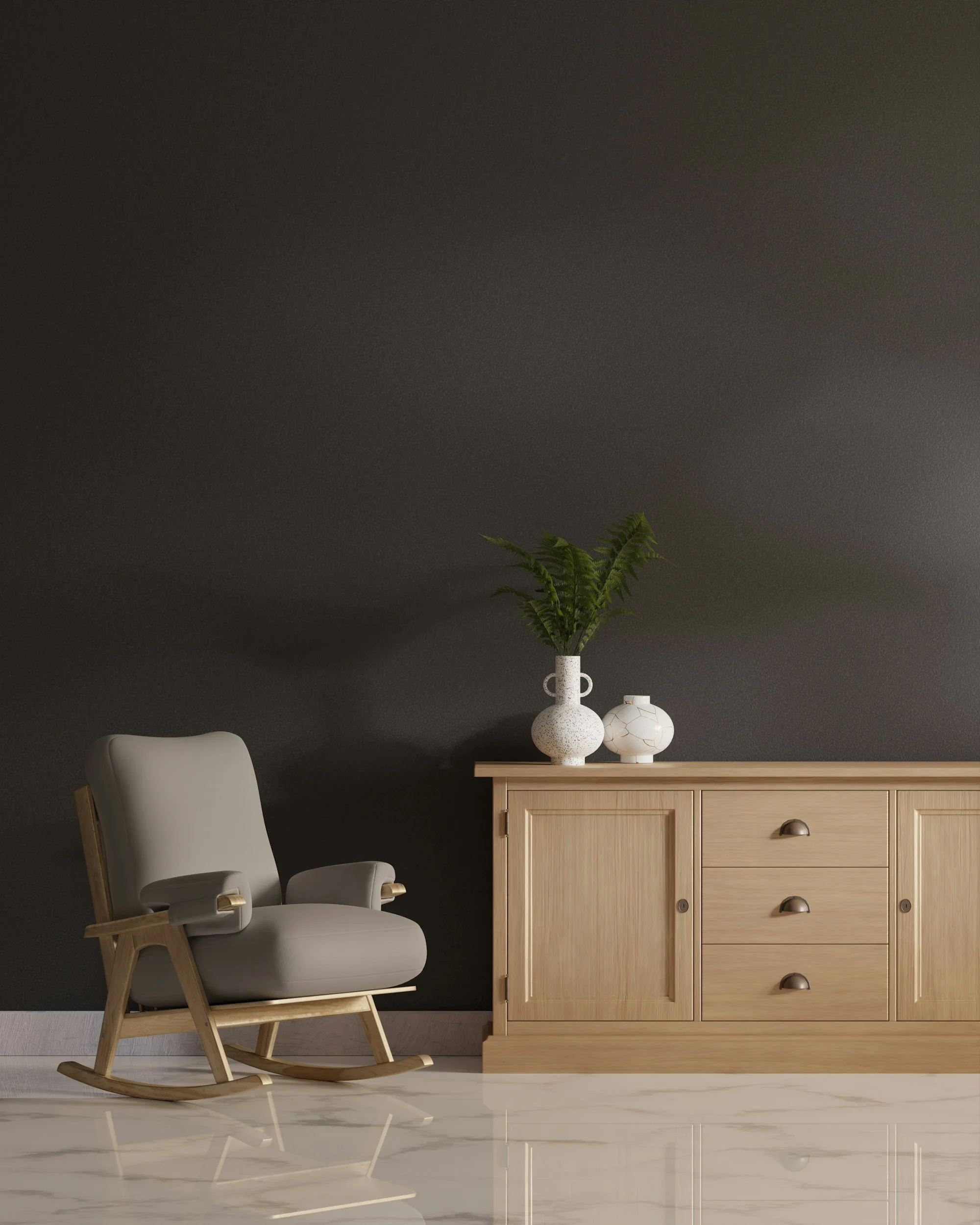
Maintenance Is the Real Luxury Signal
Luxury is never passive. It is a living practice. Discover why the quiet act of maintenance is the most profound expression of a refined home.
Most of what makes a room feel handled has nothing to do with the furniture in it. It's whether the pillows still hold their shape, whether the rug edges lie flat, whether the brass lamp has gone dull from six weeks of fingerprints. I spent decades around people trained to notice small deviations before they became real problems. A crooked stack of books isn't a crisis. It's just the first sign that nobody's been paying attention.
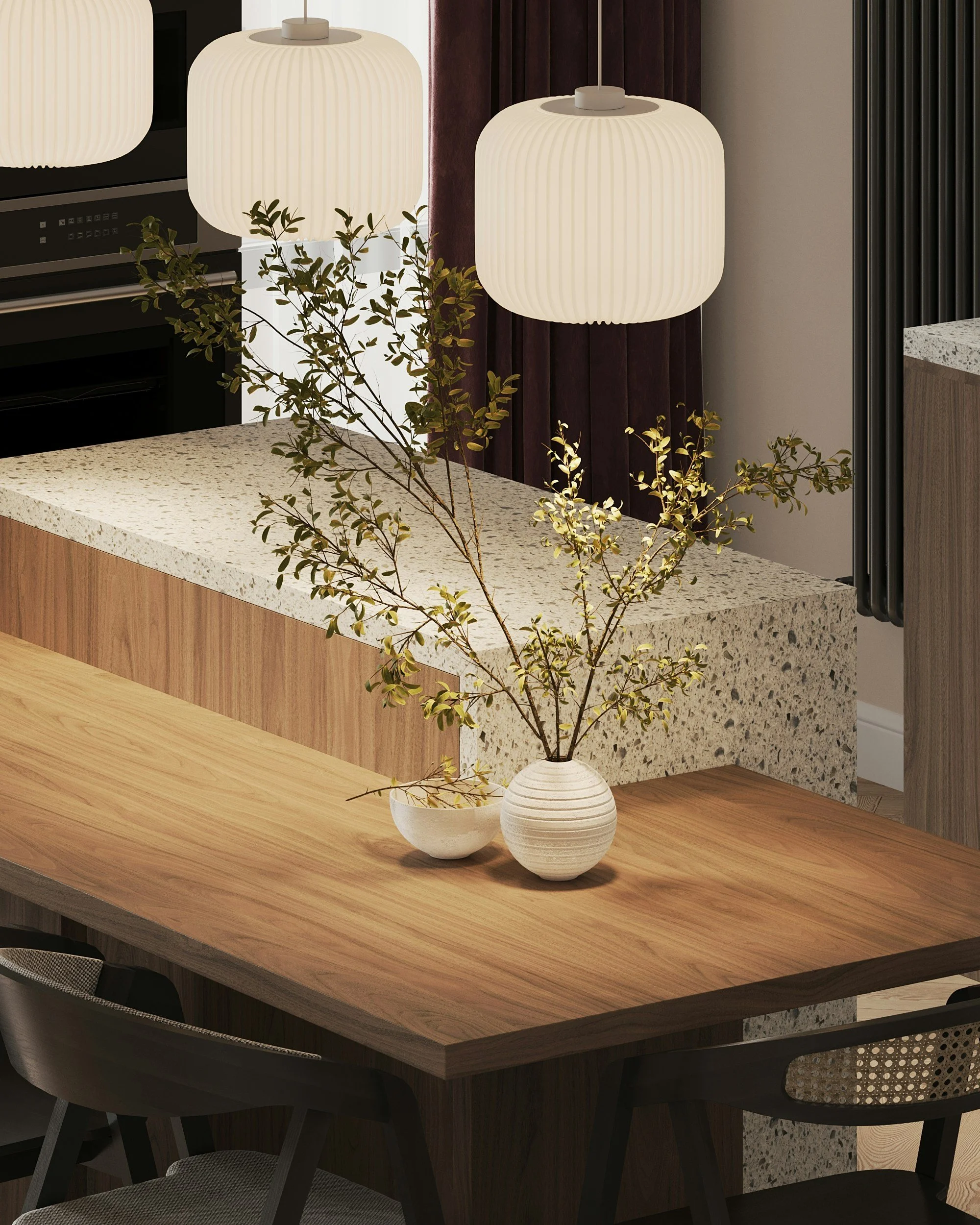
Granite kitchen island integrated with a solid wood dining table extension, mixed material transitions.
The Five Minute Reset
None of this takes long. A pass through the rooms people actually walk through, straightening what's crooked and clearing what's piled up, resets a space faster than any redesign would. Skip it for a month and the room doesn't collapse. It just starts to look like nobody lives there on purpose.
Materials Don't Forgive Neglect
Honed marble holds up beautifully and holds a grudge just as hard. Marble is calcium carbonate, and calcium carbonate reacts with acid on contact, not overnight. A splash of lemon juice or wine left on a Carrara countertop for even a few seconds can etch a dull ring into the stone that no amount of polishing removes. Sealing helps against staining, but it's worth being honest that it doesn't stop etching. The acid still gets in. The only real defense is wiping spills fast and keeping citrus and vinegar off the surface entirely.
Belgian linen asks for the opposite kind of attention. It wrinkles by design, so ironing it flat fights the fabric instead of working with it. Steam it, let it settle, and it looks more like itself for having some life left in it. Walnut wants oil worked into the grain roughly once a year, more often in a dry climate or near heat vents, or it dulls and starts to look thirsty.
Skip the technique if you're already deep into it. What matters here is the principle underneath: the materials people pay the most for are usually the ones that punish inattention the fastest.
A Rough Schedule, Not a Rulebook
I don't keep a chore chart on the fridge, but I do think in three timeframes.
Daily is the surface pass. Straighten what's crooked. Clear what's accumulated. Leave the rooms looking like someone was in them on purpose.
Weekly is the sensory layer: fresh linens on the bed, water changed for cut flowers, whatever scent you use in the house refreshed before it fades into the background and you stop registering it.
Seasonally is the real work. Rotate rugs a quarter turn so the sun doesn't bleach one section faster than the rest. Reseal stone. Check upholstery seams and wood joints for the kind of wear you won't notice until it's a repair instead of a fix.
None of this needs a schedule taped to a wall. It needs to actually happen.
The Parts You Can't Photograph
A room can look flawless in a photo and still feel wrong to stand in. A lamp on a warm dimmer changes a room more than a new chair would. An open window for ten minutes clears out staleness that no candle covers up. Furniture pulled six inches off the wall so people can actually face each other changes how a living room functions, not just how it looks in a listing photo.
None of that shows up on camera. It shows up the moment someone sits down.
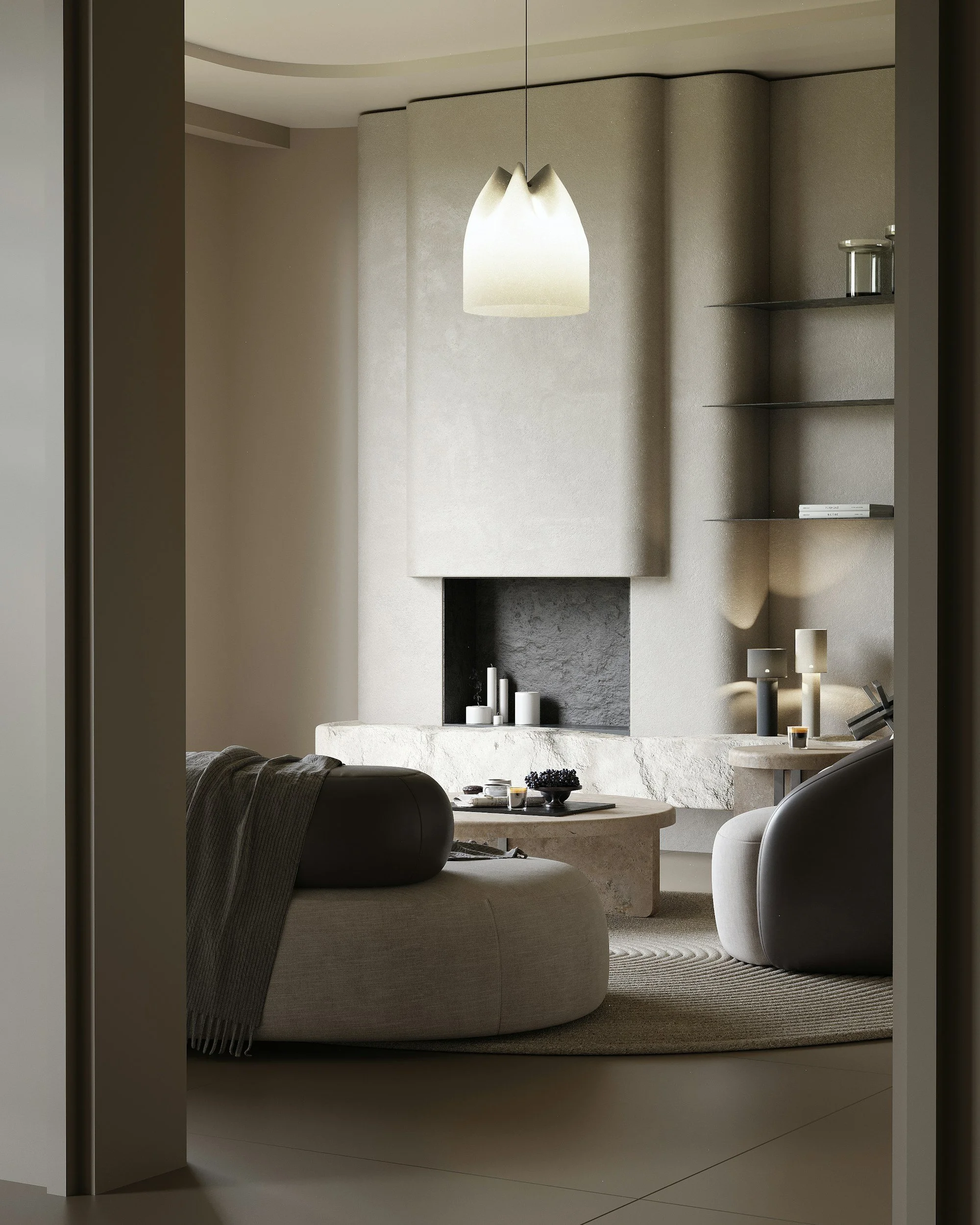
Living space featuring a marble faced fireplace, honed stone coffee and side tables, and a hand woven wool area rug.
Where to Start
Walk your own rooms and notice where your eye snags. Maybe it's a lamp base gone tarnished, or a rug that's been sitting crooked since you last vacuumed. Pick one thing. Fix it this week. The habit matters more than finishing the whole list on day one.
What This Actually Signals
A maintained home tells a specific story, someone here paid attention today, not just on move in day. That's harder to fake than good taste, and it's why a modest home that's cared for often reads as more expensive than a lavish one that isn't. The furniture was a decision made once. The care is a decision made daily.

The Sculpting of Light
Lighting is the invisible bridge between architecture and emotion. Explore the principles of layered illumination, material integrity, and the strategic curation of atmosphere."
Most of what makes a room feel expensive has nothing to do with what's in it. It's what's lighting it, and how.
Unlacquered brass light fixture featuring natural oxidation, rich tarnish variations, and a warm 2700K ambient glow.
Provenance, Even in the Fixture
I keep to a warm white, close to 2700 Kelvin, the standard for a residential space you actually want to relax in, and I dim it rather than run it at full output all day. But temperature alone doesn't make a fixture worth having. What separates a real piece from a mass produced one is what it's made of. Alabaster and unlacquered brass carry weight that a resin knockoff can't fake. Brass left unlacquered will darken and patina from ordinary exposure to air; it won't rust, and that's not a flaw. It's the finish doing exactly what it's supposed to do. Alabaster, when a light source sits behind it, doesn't just glow. It shows its own veining, the same way a slab of stone does under the right angle. These are the same standards I hold to everywhere in the home, hardware included. The fixture has to earn the same trust as the light it's throwing.
Not Every Corner Gets the Same Light
A room reads better when light isn't distributed evenly across it. Ambient, task, and accent light each do a different job, and a room that layers them well stops leaning on furniture to define its own shape.
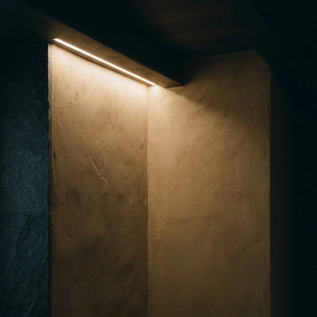
Aceiling cove with soft, warm 2700K light washing down a textured plaster wall set against deep evening shadows.
Fixtures That Disappear Into the Architecture
The real work is in what disappears entirely. A ceiling reveal can hide an LED channel completely. A sconce sits flush against the wall instead of mounted on top of it. Getting the dimming right usually means wiring it into the architecture from the start, not bolting it on after the fact. None of it announces itself, and that's the point. It's not about spectacle. It's about being able to shift a room from working light to evening light without anyone seeing the mechanism behind it.
What I Choose Not to Light
Restraint is the real skill here, more than fixture selection ever will be. Placing light with intention, and then leaving the rest of a room in shadow on purpose, is what separates a considered space from one that's simply bright. What stays dark matters as much as what you choose to illuminate.
The Two Decisions That Actually Change How a Bed Feels
Explore the materials, weaves, and layered systems that define a calm sleep sanctuary. This guide breaks down how refined bedding choices—cotton, linen, silk, percale, and sateen—shape comfort, texture, and long-term quality in the bedroom.
Ask ten showrooms what makes a sheet luxurious and eight will point to thread count. That number tells you almost nothing. I stopped trusting it years ago, back when I started handling raw greige goods before they ever hit a finishing mill. What actually changes how a bed feels comes down to two decisions: the weave, and the fill. Everything else is marketing dressed up as specification.
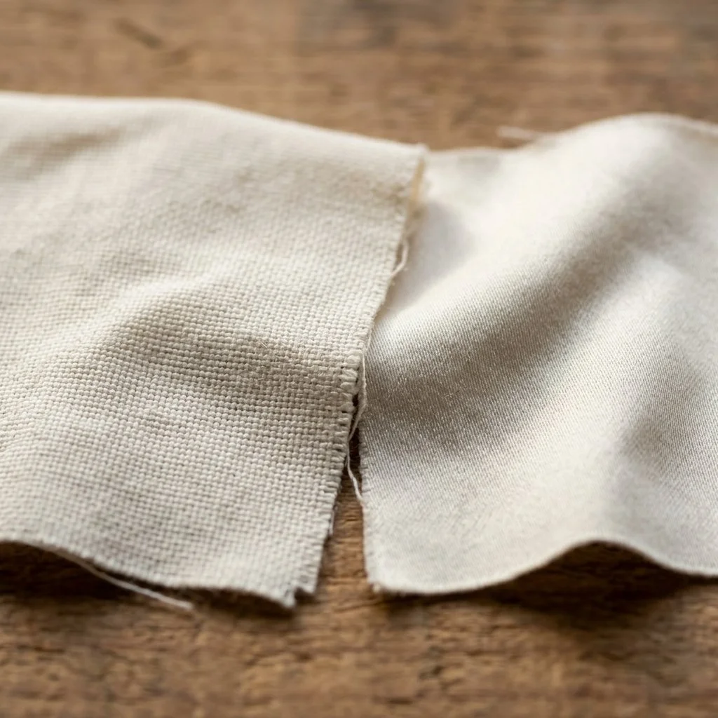
Two matching ivory cotton swatches side by side, showing a matte one over percale weave on the left and sateen weave on the right.
Thread Count Was Never the Real Number
Thread count measures density, not quality. Above roughly 400, manufacturers start plying multiple thin threads together and counting each strand separately, inflating the number without improving the fabric. You end up with a heavier, less breathable sheet sold as more luxurious. A well made 300 count percale will generally outperform an inflated 800 count sateen once it's actually on a bed.
The number worth asking about instead is weave.
Percale and Sateen Are Doing Different Jobs
Percale is a plain weave, one thread over, one thread under, in a tight grid. That structure is what gives it a crisp, matte hand and a cool surface. It's the weave behind most hospitality bedding for a reason: it holds up to industrial laundering without pilling, and it softens gradually with wear while keeping more of its structure than sateen does over the same years of use.
Sateen uses a four over, one under float weave, which puts more thread surface facing up. That's what creates the sheen and the softer, heavier drape. It runs warmer than percale, which is exactly the reason a client in Vermont and a client in Scottsdale should never be handed the same recommendation.
The Fill Is a Separate System Entirely
Duvet and pillow performance has nothing to do with the shell fabric. It comes down to fill power and construction.
Fill power measures loft, the volume one ounce of down occupies. European white goose down typically runs 600 to 800 fill power. Below 600, you're paying for warmth without much loft, and the duvet will feel flat and heavy rather than full. Above 700, you start getting genuine insulation with real weight savings, which is the difference a client actually feels when they pull a duvet up.
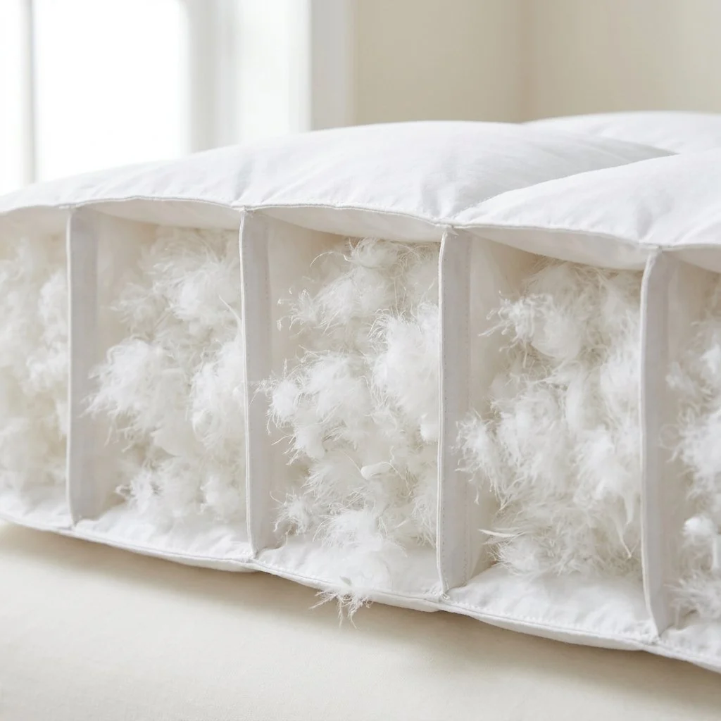
Construction matters just as much as the fill itself. A sewn through duvet, where the top and bottom fabric are stitched directly together in a grid, creates cold spots at every seam because there's no down there. A baffled construction, with internal fabric walls creating box shaped chambers, lets the down loft fully and stay put instead of shifting to the corners after six months of use. If a client is paying for a real down duvet, baffled construction is not optional.
Silk fill, less common but worth knowing, is measured in GSM rather than fill power, grams per square meter of the loose floss itself. A lightweight silk duvet runs around 175 to 250 GSM. A genuine winter weight runs 350 to 400 GSM or higher. This is a different number from momme, which measures woven silk fabric like a pillowcase or sheet, not loose fill, and the two get confused constantly in how these products are marketed. Silk fill is the better recommendation for a client who runs hot or has a wool allergy that rules out down entirely.
Cross section view of a baffle box duvet construction displaying individual fabric chambers filled with airy white down clusters.
Restraint Isn't the Same as Absence
The palette question comes after the material question, not before it. Ivory, oatmeal, sand, sage, softened charcoal, these read as restrained because they let the weave's texture do the visual work instead of competing with it. A sateen in oatmeal shows its sheen. A percale in the same tone shows its crispness. The color isn't the design decision. It's what makes the material decision visible.
Care technique for these fibers lives in its own place on this site rather than repeated here.
What a Trade Buyer Should Actually Specify
Start with weave, matched to the client's climate and hand feel preference. From there, ask what the fill actually is and how it's measured, since a duvet described only as "down" or "silk" with no fill power or GSM attached is a duvet nobody has actually specified. Thread count is the last thing worth checking, mainly as a sanity check against whatever weave and fill claims came with it. Get the weave and the fill right and the palette takes care of itself.
Why a Fabric's Weave Matters More Than Its Color
Luxury is felt through the intentional interplay of materials. Discover the Madison Prime rules for layering textures, from the contrast of stone and fiber to the balance of matte and luster, to create a home with depth, warmth, and permanence.
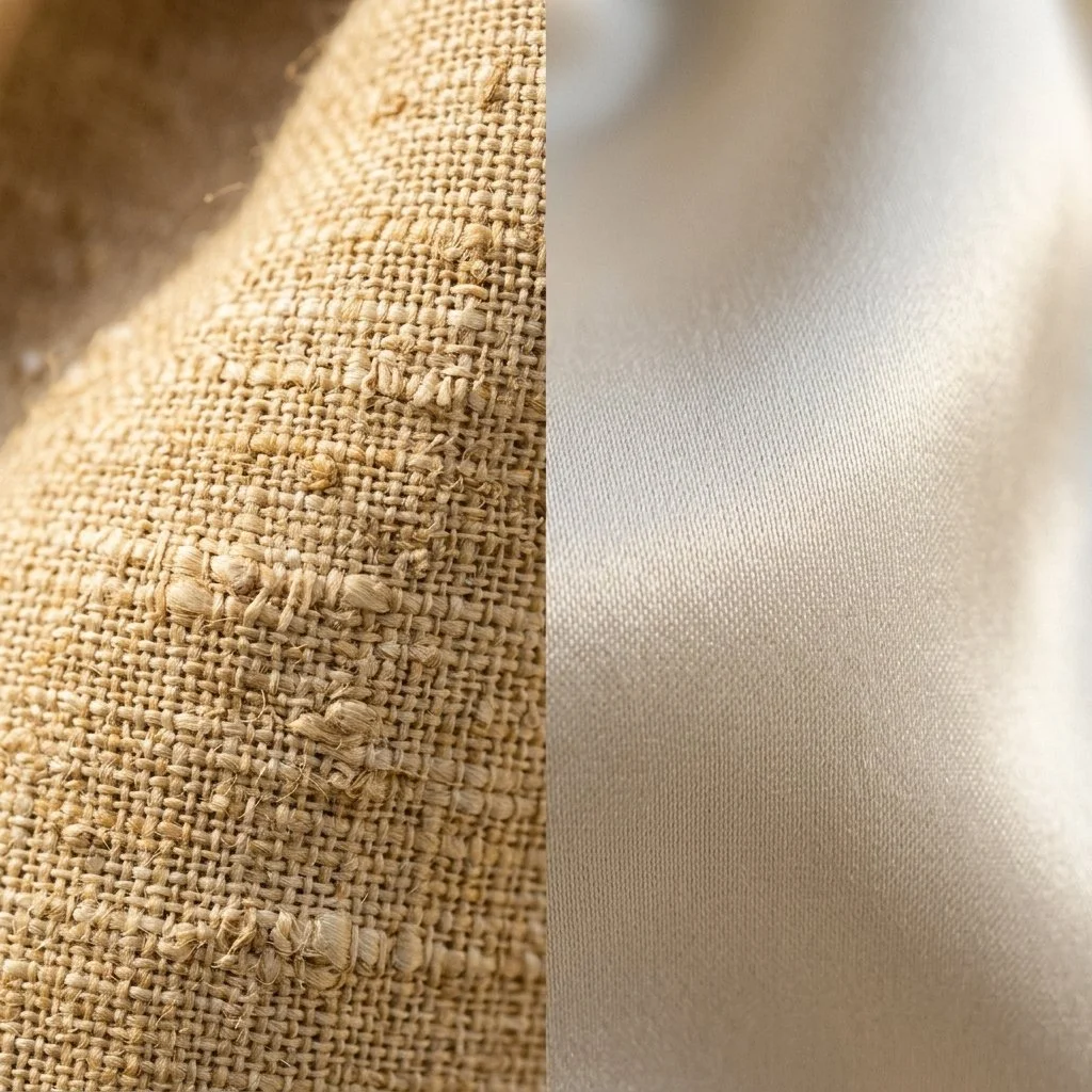
A split macro view showing the textured, slubby weave of matte honey gold tussar silk on the left alongside the smooth, lustrous weave of ivory white mulberry silk on the right.
Hold a piece of tussar silk next to a length of cultivated mulberry silk and the difference is immediate. Tussar comes from wild silkworms that feed on forest trees like sal and arjun across Jharkhand, Bihar, and West Bengal, spun by tribal communities who have worked this material for generations. Its fibers are short and irregular, which gives it a coarse, matte texture and a dull gold sheen. Mulberry silk comes from silkworms raised in controlled conditions on mulberry leaves. Its long, even fibers produce the smooth, reflective surface most people picture when they hear the word silk.
Neither is a lesser version of the other. They're simply built from different textures. Bhagalpur, in Bihar, earned the nickname Silk City almost entirely through tussar weaving, and that region's silk still carries the same rough, honest hand it always has, matte because the fiber holds onto light instead of throwing it back.
That's the real test for any fabric, not just silk. A raw linen works the same way. Run a finger along a woven line and the weave catches slightly rather than sliding smooth, which is exactly why it never throws back a shine no matter how it's pressed. A polished sateen does the opposite. The thread lies so flat and even that light glides straight off it instead of catching on anything at all. Most rooms only reach for one of these behaviors, which is what actually flattens a space, more than color ever does.
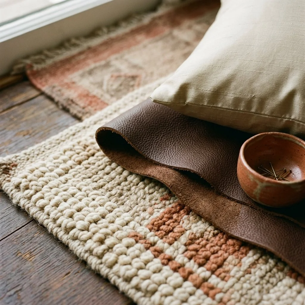
A coarse, hand knotted wool rug corner layered under folded espresso brown leather, topped with a parchment silk blend cushion.
Building a real hierarchy
Start large. A rug knotted by hand sets the base layer everything else in the room eventually sits on top of, and its quality has an actual number behind it. Flip it over and count the knots in a single square inch. Below 80 reads as coarse, tribal work built for durability over detail. Past 160, the density supports the kind of curved, intricate pattern a geometric weave never could. Move to the middle layer next, a good leather chair, a woven storage basket, pieces with real feel in the hand but without the largest physical presence in the space. Finish with the smallest scale, ceramics, a pillow with real silk in the blend, a single piece of hardware someone touches without ever really looking at it twice.
Choosing on purpose
Three fibers, chosen with real intention, do more for a room than six competing for the same attention. Once you can actually feel the difference between what you're touching, rather than just registering that texture exists somewhere in the room, that becomes obvious on its own.
No rulebook needed
The real test doesn't need a lab. Run a hand across a silk sample and watch what happens to the light. That takes about as long as reading a tag, and tells you more.