The Rug You Choose, and the One Underneath It
Luxury is a tactile conversation. It’s the shift from the structural coarseness of agave to the disciplined, hand knotted softness of highland wool.
I keep seeing the same move in the best rooms: a smaller wool rug knotted by hand, set on top of a larger, flatter one woven from agave fiber, the coarse edge showing at the border like a frame. It isn't a styling trick. One material comes from a plant, the other from an animal, and each is processed in a completely different way to do a different job on the same floor. One grew in one of the driest deserts in North America, while the other came off a sheep at altitude. Getting either one right took more than choosing a color.
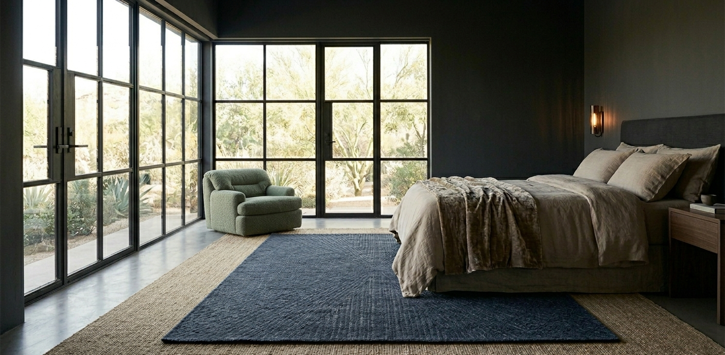
A master suite features a layered rug foundation, with a muted indigo hand knotted rug resting flat atop a larger, natural toned Ixtle agave base.
The Desert Layer
The stiff, pale fiber underneath is called ixtle, pulled from the leaves of Agave lechuguilla, a small agave armed with spines that dominates the Chihuahuan Desert across northern Mexico. Only the leaves are useful for this. They're pounded by hand until the long fiber strands separate out, a trade called jarciería that's been passed down for generations. A few workshops in towns like Mina, in Nuevo León, still practice it. Plastic nearly ended that trade a few decades ago. It's coming back now, mostly because people want a floor that grew somewhere real instead of one that was extruded.
Raw ixtle comes off the plant a natural creamy white, without the manufactured evenness a synthetic fiber gets from a dye vat. That paleness is structural, not decorative. It's the reason this fiber reads as a foundation rather than a finish, and why it sits underneath the wool instead of competing with it.
The High Altitude Layer
Wool does something ixtle can't. A single wool fiber is built from two types of cell that grow at slightly different rates, which twists the strand into a tight, spring like coil. That coil is why wool can stretch by close to a third of its length and still snap back to its original shape instead of tearing. A synthetic fiber that gets crushed under a chair leg stays crushed. Wool recovers, often for decades, which is the real reason a wool rug knotted by hand is described as something that improves with use instead of something that simply wears down.
The same fiber carries its own protection. Lanolin, the natural wax sheep produce, coats each strand and repels water and soil before either has a chance to set. None of that is a finish applied at a factory. It's already in the material when it arrives.
Knots, Not Glue
The easiest way to tell a rug knotted by hand from a machine made or tufted one has nothing to do with the front. It's the back. On a true hand knotted rug, a weaver ties each pile knot directly onto a vertical warp thread, then packs it tight with a comb before the next row goes in. Flip the rug over and you see the same pattern in mirror image, because there's no backing hiding it. The fringe isn't stitched on afterward. It's simply the exposed end of the warp, the same threads that ran under the pile the whole time.
A tufted rug is built the opposite way. Yarn gets punched through a canvas backing with a handheld gun, then a layer of latex is glued underneath to hold it in place. The fringe on those pieces is usually a separate strip, sewn on to imitate what the knotted version does naturally.

Hand knotted wool rug, resting atop a woven, natural toned Ixtle agave rug.
Check the Back First
A layered rug asks you to trust two different origins at once: a desert plant harvested by hand in northern Mexico, and a fleece grown at altitude somewhere colder. Both earn their place because of how they're made, not just how they look. Before I recommend either one, I check the back for real knots and ask where the ixtle was processed. Color comes after that, never before it.
For sourcing, I go to two different places for two different materials: a specialist rug importer who can show a knotted piece's actual origin and construction, and one of the small cooperative workshops still doing jarciería in northern Mexico for the base underneath it, rather than a mass import warehouse for either.

Where the Kitchen Ends and the Dinner Begins
True hospitality is invisible. Discover the logic of the social partition, an architectural boundary of timber and stone that protects the atmosphere of the evening.
A pan dropped mid plating, four burners running while someone's still hunting for the good napkins. Open plan kitchens are built for a family's Tuesday morning, not the twenty minutes before people arrive for dinner. The room that felt generous all day suddenly has nowhere for the work to hide.
Designing kitchens with an actual boundary in mind, one that has nothing to do with square footage and everything to do with what a guest is allowed to see.
Central slatted Tzalam screen, serves as the primary visual shield, between the kitchen and dining area.
A Screen That Reads as Architecture, Not a Curtain
A floor to ceiling Tzalam screen is my usual answer. Vertical slats block the direct sightline into the work zone while still letting light and conversation pass through the gaps. Tzalam's grain is straight and clearly defined, so each slat reads as its own line rather than a repeated pattern, which matters when you're looking at forty of them at once.
For a softer version, I like heavy tanned leather panels instead. They do for sound what the screen does for sight: a soft surface between the two rooms instead of hard ones knocking noise back and forth. I've also started specifying Henequen, the plant fiber native to the Yucatan that the Maya call Ki. It's the same fiber that built enormous fortunes across the region in the nineteenth century, when the world's ships ran on henequen rope and a war overseas cutting off the competing supply sent prices soaring. Most people still picture it as coarse cordage. A few artisans in Yucatan are weaving it finely enough now that it reads as a textile, set into dark timber frames, with none of the rope like weight the material's history suggests.
The Facade That Hides the Work Behind It
The most effective partition doesn't feel like a partition at all. I like a Cantera stone pantry or prep wall, the same volcanic stone I've used elsewhere as carved objects, here doing the opposite job: a solid, upright mass instead of a shaped one. Clad in it, the working side of the kitchen reads as a permanent part of the house rather than a functional add on.
The detail that actually gets noticed up close is the hardware. Hand forged iron pulls or sandcast bronze handles turn utilitarian cabinetry into the one piece of jewelry the wall is wearing. Neither needs to explain itself. They just need to feel like they were made by someone's hands, because they were.
Light That Chooses What You See
Lighting does more of this work than people expect. I keep the kitchen itself low and amber, almost a background hum, while the dining table gets a warm, sharp pool of light from a low slung, oxidized bronze pendant. The eye follows the brightest point in the room. Put it over the table and the kitchen edges out of view on its own.
Where I want the whole room to feel handmade rather than built, I turn to Chukum, a lime plaster the Maya have used for centuries, made by boiling the bark of the Havardia albicans tree until it releases a tannin rich resin, then mixing that resin with limestone. The result is genuinely waterproof, historically used to line hacienda cisterns and ponds, and it dries to a matte, faintly uneven finish that no machine applied plaster can fake. Its color depends on which of the region's bark varieties went into the mix and how finely the limestone was ground: sometimes a pale beige, sometimes a deeper, almost ash grey. On the wall behind a partition, it gives the room a texture that looks touched rather than sprayed.
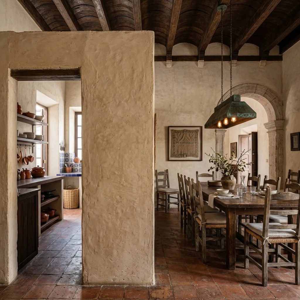
A freestanding Chukum plastered partition divides a dining area from a glimpsed kitchen.
The Work Happens Somewhere Else
The kitchen doesn't disappear behind any of this. What disappears is the fifteen minutes between courses, the plate cleared and the next one set down, happening somewhere the conversation can't see it. That reset is what the partition actually protects.
A partition like this is rarely part of the original plan. It shows up later, once a house has been lived in long enough for someone to admit the layout doesn't work for how they actually host. That makes it exactly the kind of project for whoever already knows your house, the carpenter who built your cabinets, the mason who laid your floors, not a new specialist. You already have the person. You just haven't given them this idea yet.
The Vessel That Holds the Room
Every great collection needs an anchor. Discover the power of the 'Hero Piece', a single, high caliber object that gives your surfaces a sense of direction and weight.
I didn't expect to find design theory backing up something I already do by instinct, but there's an actual term for it: visual weight. A dark, textured object reads as physically heavier than a pale, smooth one the same size, even though nothing about its real mass has changed. Photographers, painters, and graphic designers use this on purpose, to control where the eye lands first and how long it stays there. A living room works the same way. Give one object enough visual weight, and it becomes the thing everything else in the room organizes around, without you doing anything else to earn it.
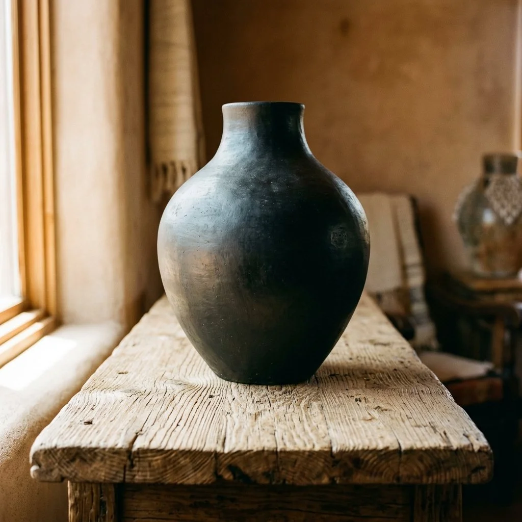
A large, matte black Barro Negro pottery vessel sits centered on a weathered, rough hewn wooden console table.
The Eye Reads Weight Before It Reads Detail
Size is still the biggest factor, but color and finish do real work too. A dark, matte surface absorbs light instead of bouncing it back, so the object holds its own edges instead of blending into whatever sits behind it. That's why a single black clay bowl the size of a dinner plate can outweigh, visually, a whole shelf of smaller pale ceramics. I keep coming back to two materials that do this without trying: matte black clay from Oaxaca, and volcanic stone quarried across central Mexico.
A Craft Two Thousand Years Older Than the Trend
Barro negro, black clay, comes from San Bartolo Coyotepec in Oaxaca, where Zapotec and Mixtec potters have worked the same local clay for roughly 2,500 years. For most of that history it fired matte, in tones of black and gray, sturdy enough to survive being knocked around as an actual working jar. In the 1950s, a potter named Doña Rosa discovered that burnishing the nearly dry clay with a smooth stone before firing produced a glossy, mirror black finish instead. It's the version most people picture now, and it's also more fragile and more porous than the traditional matte form. For an object meant to live in a room and get handled, the older, unburnished version is the one worth owning. It takes daily use without wearing down, and its surface does exactly what a heavy anchor piece needs: it absorbs the light in the room instead of throwing it back. Some of the same families in San Bartolo Coyotepec still fire it in pit kilns dug into the ground, the way their grandparents did.
The Stone Colonial Mexico Was Built From
Cantera is a volcanic tuff. The word itself just means "quarry" in Spanish, which tells you how central it's been to Mexican building for centuries. It's the stone behind the cathedrals and haciendas of Guadalajara and Querétaro, carved into columns, fountains, and church façades that are still standing. It's also genuinely porous and light for a stone, which is what lets it be carved into a real vessel without the crushing weight of granite or basalt. The color shifts by quarry, running gray in one region and gold in another. Oaxaca's version is different: a distinct green, the result of volcanic ash settling into a silt bed before it hardened. A single Cantera vessel carries that same architectural lineage indoors.
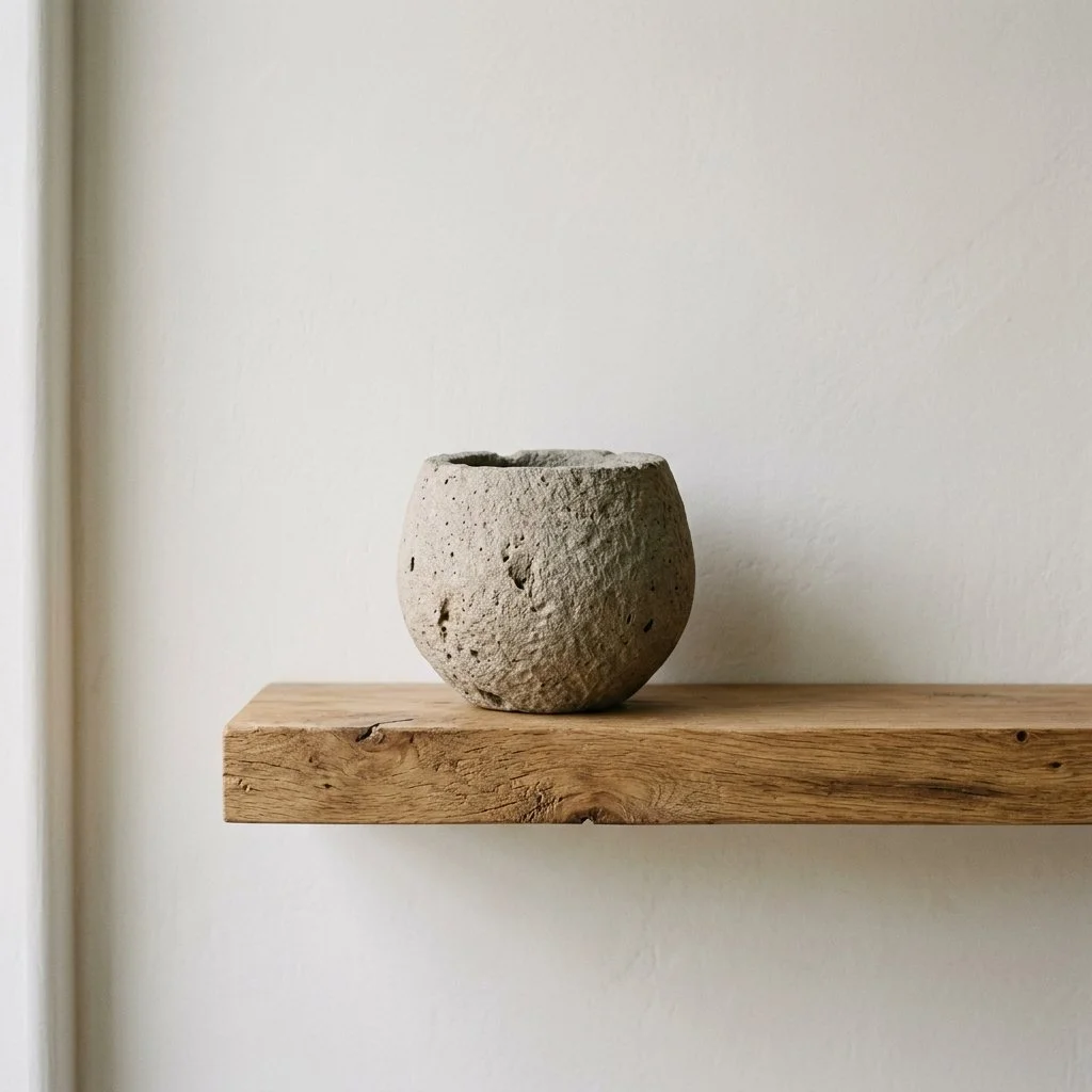
Hand carved porous Cantera stone vessel resting on a rustic, floating solid wood shelf.
Where One Object Does the Most Work
In the kitchen: a matte black clay bowl against a stone island reads as texture against texture, not competition.
In the bedroom: a small Cantera vessel on a timber ledge gives a lighter textile palette one grounded point.
In the entryway: a tall black clay jar sets the material tone of the whole house from the moment someone walks in.
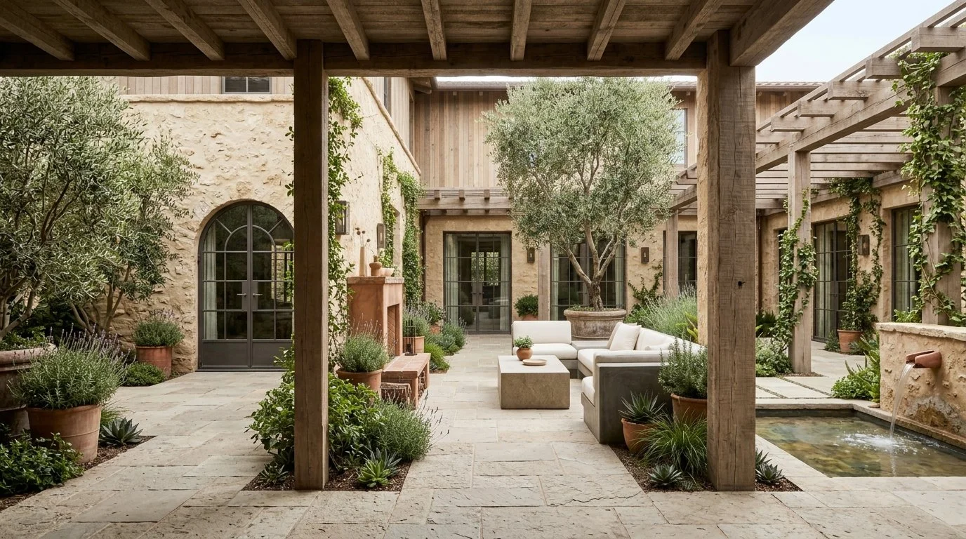
A Courtyard Has to Earn Its Keep
A courtyard shouldn't feel like an empty void. It should be a room without a ceiling. Discover how to use solid stone slabs and hand cast bronze to turn the center of your home into its most lived in sanctuary.
A courtyard house is one of the oldest architectural ideas people never stopped building. Archaeologists trace the form back roughly eight thousand years to Neolithic settlements in the Jordan Valley, and it turns up again centuries later in the Roman house, where the central opening had a name and a job: the impluvium, a shallow basin set to catch rainwater falling through a gap in the roof. When Roman building tradition met Islamic architecture in southern Spain, that opening became the Andalusian patio, the literal heart of the house rather than a leftover gap in the plan. Córdoba still holds a spring festival judging the best kept patios in the city, which tells you how seriously that tradition takes a space most modern houses treat as an afterthought. Spanish colonizers carried the same layout to the Americas centuries later, which is why a courtyard in Guadalajara and a patio in Córdoba are still, structurally, the same idea wearing different stone.
A courtyard survived eight thousand years of shifting architectural fashion because it did real work. It pulled light into the middle of a windowless house, and it let air move where a sealed room couldn't manage on its own. The privacy came free, since nobody on the street could see in. If your courtyard isn't doing any of that, filling it with beautiful things won't fix the plan underneath it.
Courtyard with continuous stone flooring, outdoor seating, a central olive tree, a terracotta hearth, and a small water feature framed by wooden beams and stone walls.
The Fire Needs Clay, Not Iron
Once the courtyard exists, it needs a reason to hold people after dark, and a fire does that better than any light fixture. I steer people away from imported cast iron fire pits here and toward a fireplace or chiminea built from clay, shaped by hand and fired at high heat. Terracotta and metal behave completely differently around a flame. Metal heats and cools with the fire itself, throwing hard, uneven heat for as long as the flame lasts and almost none after. Clay absorbs heat slowly through the whole mass of the wall, then gives it back slowly too, so the warmth around a terracotta hearth outlasts the fire itself. That's thermal mass. It works the same way a courtyard's own stone floor and walls already do all day, just concentrated into one object.
The Bronze Doesn't Stay Bronze
Any bronze lantern or candlestick left outside starts changing the moment it's cast. Fresh bronze develops a thin reddish brown skin almost immediately on contact with air, a compound called cuprite. Left outdoors and exposed to rain and humidity, that skin keeps reacting, and the copper in the alloy slowly converts into a family of green toned compounds, mostly copper carbonates and sulfates, that collectors call verdigris. It's the same chemistry that turned the Statue of Liberty green over decades. A finisher who wants that color without waiting decades will accelerate it with heat and chemicals, then seal it under a thin coat of beeswax once it reaches the shade they're after. The wax isn't cosmetic. Without it, the same reaction that made the color keeps eating into the metal underneath.
Terracotta's Whole Argument Is That It Breathes
The planters holding a courtyard's trees do more work than they get credit for. Terracotta is a porous clay, unlike glazed ceramic or plastic, and that porosity lets air and moisture pass straight through the pot wall instead of pooling against the roots. An olive tree tolerates almost nothing worse than wet feet, so that single property matters more here than color or shape ever will. A well made terracotta pot is fired above 1,000 degrees Celsius specifically so the clay can survive freezing nights outdoors without cracking, which is why a pot thrown in Izmir or Tuscany can sit in a courtyard through winter instead of coming inside every October.
The Stone Doesn't Need to Prove Anything
Whatever surfaces you set between the seating, whether cut from volcanic rock or the same honed limestone running through the house, they should be solid enough that nobody mistakes them for patio furniture. A single heavy slab reads as architecture. A stack of thin, veneered pieces reads as something bought for a season. I'd rather spec one heavy slab than three matched pieces that all have to be replaced on the same schedule.
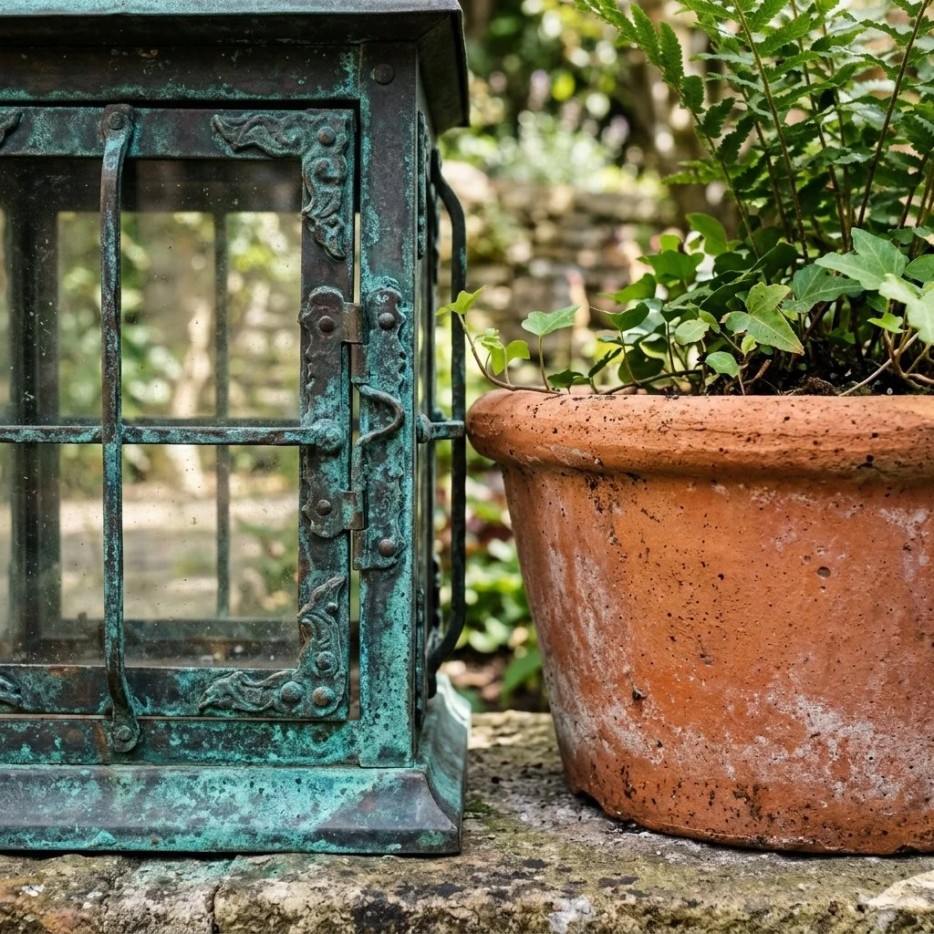
Aged bronze lantern displaying a rich verdigris green patina resting beside a weathered terracotta planter.
The Test Is Whether You Actually Sit There
A courtyard filled with the right materials and never used is just an expensive gap in the floor plan. Terracotta earns its place by keeping people warm after dark. Bronze earns its by aging instead of corroding, and stone earns its by refusing to look temporary. You now have a reason to stay outside.
The Sky Level Window
Direct sunlight is the enemy of organic materials. Discover the 'Sky Gap', the architectural standard for illuminating a room with high level light while protecting your rare wood and leather furniture from the elements.
Architects have been building rooms this way for four thousand years, and preservation had nothing to do with it at first. In the temples of ancient Egypt, builders left narrow gaps in the stone slabs above the roofline of the side aisles so light could reach the hall of columns without cutting into the outer wall's strength. Roman basilicas did the same thing with a raised upper wall pierced by windows. So did the naves of Gothic cathedrals centuries later. I hadn't expected a four thousand year old lighting problem when I started reading about high windows, but it changed how I think about placing them. The device has a name now: a clerestory, from the Old French for "clear story," a run of windows set high on a wall, above eye level. In a house, the appeal isn't cathedral drama. It's the same thing that made a temple builder cut those gaps in the first place. Light, without a direct hit.
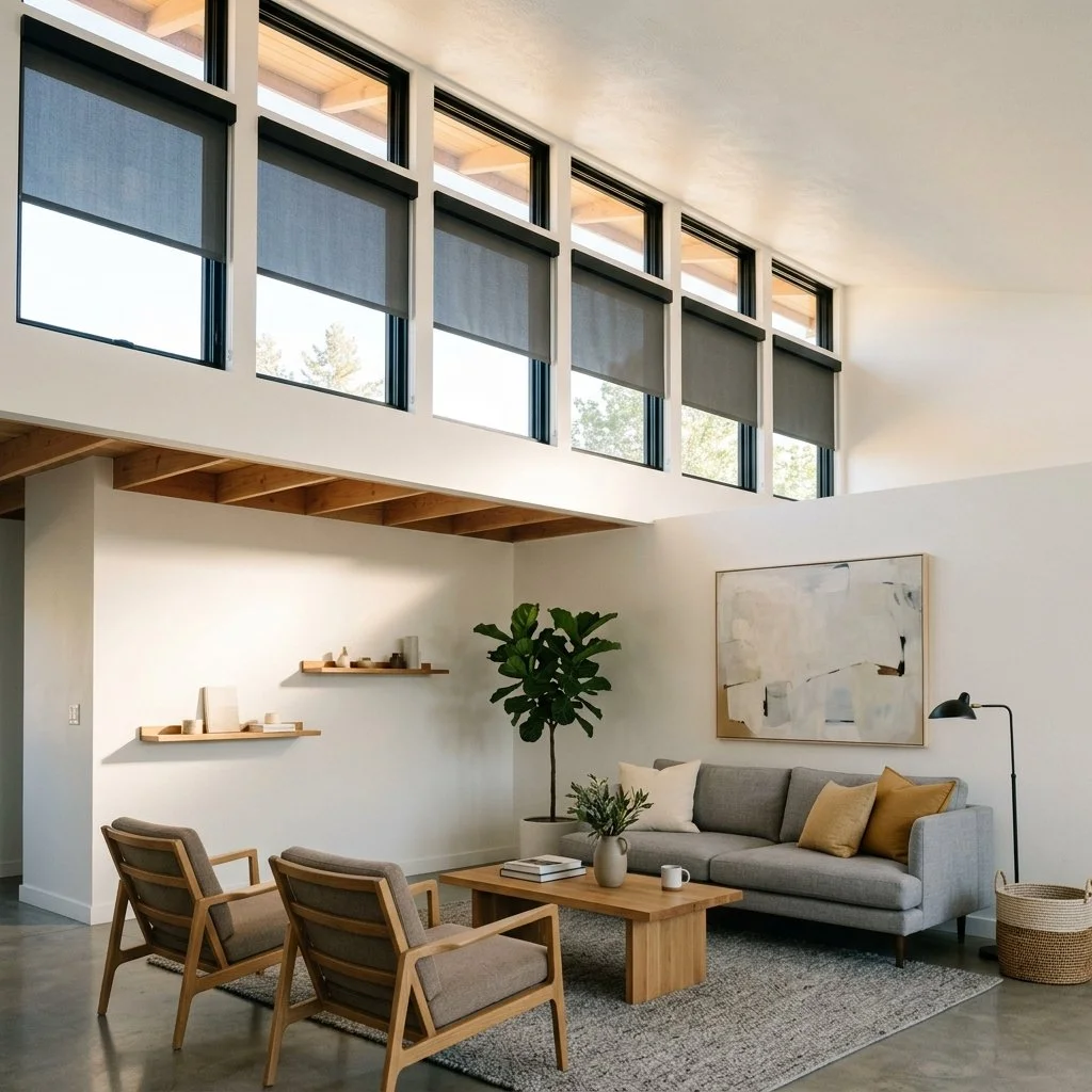
Living room features a row of high clerestory windows with partially lowered dark shades.
The Light Arrives Secondhand
A floor to ceiling window puts the sun's beam directly on whatever sits across from it, at exactly the height where your furniture lives. A clerestory changes the geometry. Light entering high on a wall travels across the ceiling and down the upper walls before it reaches the room. It arrives scattered, not as one hot, direct shaft. The room still reads as bright. It just isn't being hit.
The Air Moves Because the Heat Does
Warm air is lighter than cool air, and it rises looking for somewhere to go. An architect I spoke with put it simply: point where you want the heat to leave, then let the air do the rest of the work. Physicists call the result the stack effect, sometimes the chimney effect. The taller the space and the bigger the temperature difference between inside and out, the stronger the pull. Put an opening at the top of that column of air and warm air escapes through it. Pair that with an operable window down low and cooler air gets drawn in to replace it, no fan required. A clerestory placed correctly does both jobs. It lights the room and gives the heat an exit.
What Fifty Lux Actually Means
I hadn't thought about a fifty lux limit until I asked why museums bother measuring light at all. Conservators don't guess about exposure, they measure it. The standard most museums work from caps illumination on the most vulnerable materials, dyed leather and textiles among them, at 50 lux. Wood and upholstered furniture get more room, generally 150 to 200 lux, before the same clock starts running. Ultraviolet radiation alone accounts for roughly 40 percent of that damage, and it's cumulative. An hour at high intensity does the same harm as several hours at a lower one. The aniline leather I wrote about, the Tzalam heartwood in a piece of case furniture, none of it survives decades in raw, direct sun no matter how well it was made. It survives because someone decided, on paper, before the walls went up, not to let it sit in that light all day.
Glass That Changes Its Mind
A clerestory this high is usually out of reach, which makes it a natural place for glass that manages itself. Electrochromic glass carries a thin coating of metal oxide ions between two conductive layers. Apply a small, low voltage current and the ions migrate between the layers. The glass shifts from clear to tinted and back, with no moving parts at all. Most versions reach full tint in a few minutes and hold that state without drawing further power until the current reverses it. It's a genuinely different animal. That glass is set once, at manufacture. This kind changes its mind by the hour, in response to where the sun actually is.
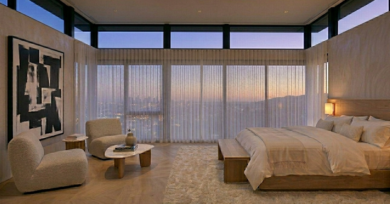
Bedroom at dusk, featuring clerestory windows and shear loomed curtains revealing a soft city skyline view.
When You Can't Move the Wall
Not every house has the ceiling height for a true clerestory, and the same protection can be approximated without touching the architecture. A tight, densely woven linen, hung high above the window frame and wide past its edges, blocks more UV than a loose or sheer weave does. It's the same principle behind sun protective fabric generally: density does the work. It breaks a direct beam into something softer before it reaches the room. The view stays intact.
An Old Idea With New Wiring
None of this is new engineering. It's the same gap a builder cut into a temple wall four thousand years ago, still doing the same two jobs. Bring in light. Keep out what damages what's underneath it. The only thing that's changed is the current wired into it.
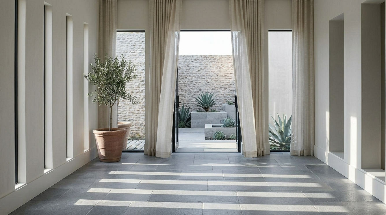
The Shape of a Shadow
Light isn't just about visibility, it's about contrast. From ancestral backstrap loomed linens to the sharp geometry of an architectural sun slit, discover how we treat the sun as a raw material to paint a composed, intentional wall.
I've started paying more attention to what the light in a room doesn't reach than what it does. Vision scientists call this shape from shading. Depth and form get read almost entirely from variation in light, not from brightness itself. A room lit evenly in every corner gives your eye nothing to work with. It reads as flat because, to your brain, it actually is.
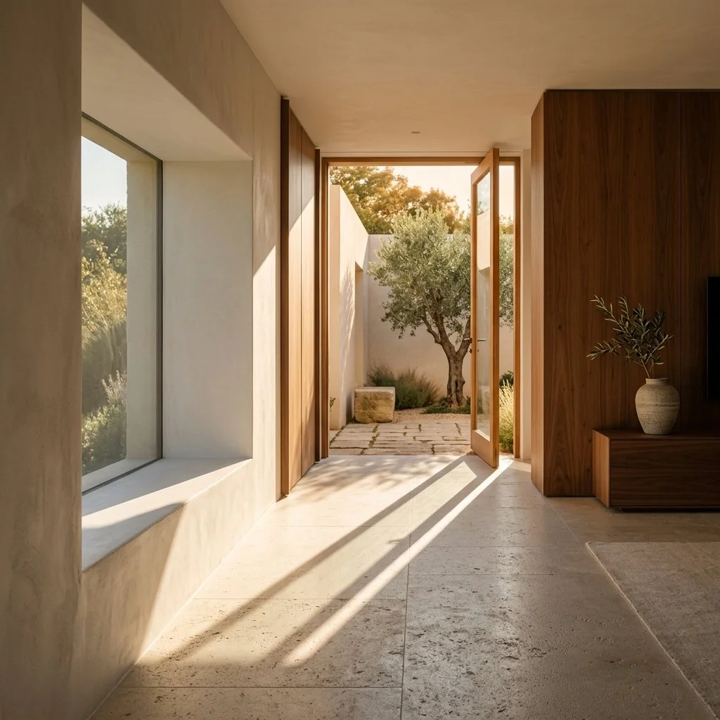
Interior featuring white plaster walls, warm walnut accents, and honed limestone floors illuminated by late afternoon sunlight.
The Wall as a Canvas
A clean architectural wall doesn't need art hung on it. It needs the sun. When I position openings to catch the day's movement rather than just to let light in, the wall itself becomes the changing element in the room. At ten in the morning, a shadow might fall in a thin diagonal line near the floor. By late afternoon, that same wall shows something else. The shadow has stretched and softened, and it crosses a different plane of the stone now. Stone especially rewards this. Raking light at a low angle catches the micro texture that direct overhead light flattens out, so the same slab of limestone or travertine can read as smooth at noon and geological at five o'clock.
Contrast as Comfort
There's a real psychological function to shadow that gets lost when a room is designed purely for brightness. A space that's lit uniformly in every corner feels exposed, almost clinical, the way an operating room or a big box store does. Shadow gives a room scale. It tells your eye where a hallway ends and something more private begins. Neither a wall nor a door has to do that work. I think of certain corners of a house as deliberately unlit, not because I ran out of fixtures, but because a room that never lets the eye rest anywhere never actually settles.
Controlling Where the Light Enters
I'm not looking for big windows. I'm looking for a specific, controlled point of entry. A narrow vertical slit does something completely different to a room than a niche set deep into the wall, even at the same square footage of glass. Architects call the depth of that opening the reveal. A deep reveal does real work. It blocks the sun through most of the day and lets it in only at one specific hour and angle, so the shadow it casts crosses the floor at nearly the same time every day, like a sundial. In hotter climates, a brise soleil does something similar on a larger scale. It's a fixed screen or a set of fins mounted outside the glass that filters direct sun into a pattern of shade, so the room still breathes. Control the entry point instead of just maximizing it. You're not letting the sun in. You're drawing with it.
The Weave That Filters It
Not every house gets to make these decisions at the architectural stage. Most of the time I'm working with existing openings, and that's where the textile does the job the wall can't. I keep coming back to handwoven Oaxacan cotton for this. Weavers there still work the backstrap loom, telar de cintura, a technique that predates the Spanish conquest by more than a thousand years. One end ties to a post, the other to the weaver's own waist, so her body supplies the tension. In Santo Tomás Jalieza, the town outside Oaxaca City where most of this weaving happens, Friday is still market day, when the number of women selling in the plaza roughly triples. That process produces a slightly irregular thread, nothing like the uniform thickness of a machine loom, and that irregularity is exactly what scatters harsh light into something softer instead of letting it pass through as a hard, flat shaft. Cloth woven on the treadle loom, worked by foot pedal and introduced later, gives a tighter, more even filter, useful in rooms that want the softening effect without much visible texture.
For the rooms where I want that atmosphere on demand rather than fixed in the fabric, motorized blinds do the technical version of the same job. One is a sheer weave that still moves with the air. The other is a full blackout panel for a room that needs to go completely dark. Both run off a single switch. It's the same instinct, applied with a switch instead of a loom.
Windows cast shadows on a stone floor with natural fiber window treatments on an open door heading to a private courtyard.
The Sun Was Always the Material
Light itself costs nothing. What it does in a room, once you decide where to let it in and what to filter it through, is the actual design. I'd rather build a house around where the shadow falls at five o'clock than around how many lumens a fixture puts out. The sun was always the material. Everything else, the reveal and the weave in the curtain, is just how I've learned to shape it.

Where Iron Draws the Line
Stop playing it safe with neutral tones. Discover how we use vegetable tanned oxblood leather and blackened iron to give a modern room the weight, depth, and permanence it’s missing.
Most people assume blackened iron is painted. It isn't, and that was news to me too the first time I asked. The color comes from a chemical bath, not a brush, and once you know what that bath actually does, you stop seeing this finish as a color choice and start seeing it as a material that says exactly what it is.
A hand forged piece of glowing orange steel rests on a heavy iron anvil mid strike.
What the Bath Actually Does
I don't forge this myself, but a blacksmith once walked me through exactly why the color happens the way it does, and it's stuck with me since. Blackened iron is not painted, they told me. It goes through a hot chemical bath, around 286 degrees Fahrenheit, that converts the surface of the iron itself into black iron oxide, the mineral magnetite. In the trade, this is called a conversion coating, and the name says the whole thing: the surface is converted into something else, not covered by something else. Nothing sits on top of the metal. The metal itself changes.
I asked why that mattered, and this is the part that stayed with me. The resulting coating is roughly a micron thick, thinner than any painted or plated finish could ever be. A conversion coating reacts with the metal, they told me, an applied coating like paint just bonds to it. Once you hear the difference explained that way, paint and plating start to look like the same idea under two different names. Because the finish is porous rather than sealed, it gets oiled afterward, both for rust protection and because that oil is what gives blackened iron its deep matte sheen instead of a shine. Chrome and stainless work the opposite way, they pointed out. Plating adds an actual physical layer to the surface, which is part of why polished metal can read as clinical or lab grade in a room built for warmth. Blackened iron never adds anything. It just becomes what it already was, darker.
The Grain Remembers the Hammer
The forging part is what actually surprised me. Mild steel gets heated toward 2,500 degrees, they explained, until it glows a specific bright yellow orange, and a blacksmith judges that temperature by eye. There is no gauge for it in most shops. Just years of watching the same color under the same light.
Once the metal reaches that state, hammering does not remove any material the way machining does, they told me. It compresses and realigns the grain structure inside the steel to match the final shape. They were clear that this is a real, physical difference, not a romantic one. A forged support carries a density that a cast or machined piece at the same dimension does not have, because the metal's internal structure has actually been worked, not simply cut.
Profile Over Ornament
I look for pieces with sharp angles and slim profiles, not scrollwork or rustic texture. Done this way, the iron reads as precision instead, a profile slim enough to disappear on its own, and sharp enough at the edges to tell you exactly where the furniture begins.
It also pairs naturally with neutral tinted architectural glass. A slim blackened profile all but disappears into that glass's own shadow, and the view gets to do the rest of the work instead of the frame competing with it.
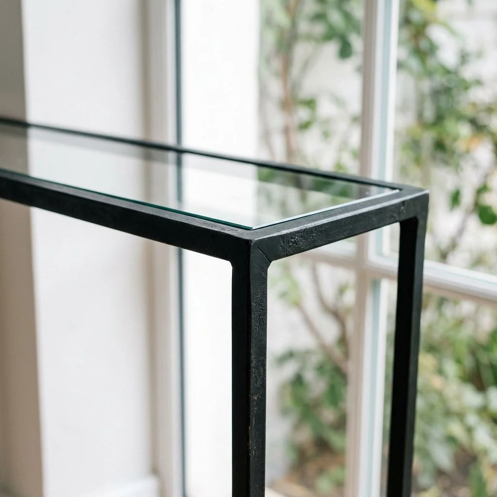
A slim, matte blackened iron console frame set against a bright, glass window backdrop.
Small Doses, Real Weight
Not every room is ready for a full iron frame, and that's fine. A single forged iron tray on a stone surface, or blackened hardware pulls on a run of cabinetry, can do the same job in miniature. These smaller pieces act as a tether. They give a light, glass filled room real weight without asking it to give up its openness.
The Bath, Not the Brush
Trends fade because they're surface decisions, something painted on that eventually reads as dated. Blackened iron doesn't have that problem, because the color was never a decision made on top of the metal. It's a conversion the metal actually went through.
When a client wants this for real, I point them one of two places. Some pieces go to a metal fabricator I trust, someone who works from a drawing and can repeat the same line across several pieces without any of them drifting. Other times, when the piece is meant to be the only one of its kind, I go straight to a blacksmith taking direct commissions. It costs more and takes longer, but it's the only way to end up with something that was actually hammered into its shape, not assembled from stock parts.
A finish that comes from a chemical reaction rather than a paint chip doesn't go out of style, because it was never in one to begin with.
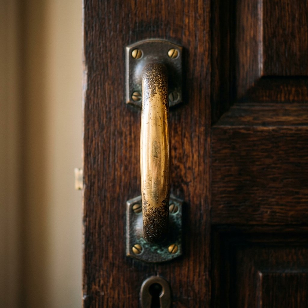
Living Bronze
Most hardware is coated in plastic to keep it from changing. We prefer a metal that actually responds to you. Discover why living bronze is the only choice for a house that ages well.
Lacquer on hardware exists to freeze a look in place. It works, for a while. Then it cracks, or wears thin exactly where fingers hit it every day, and what's left looks cheaper than the raw metal underneath ever did. I don't coat my bronze. I don't need to. The metal is built to change.
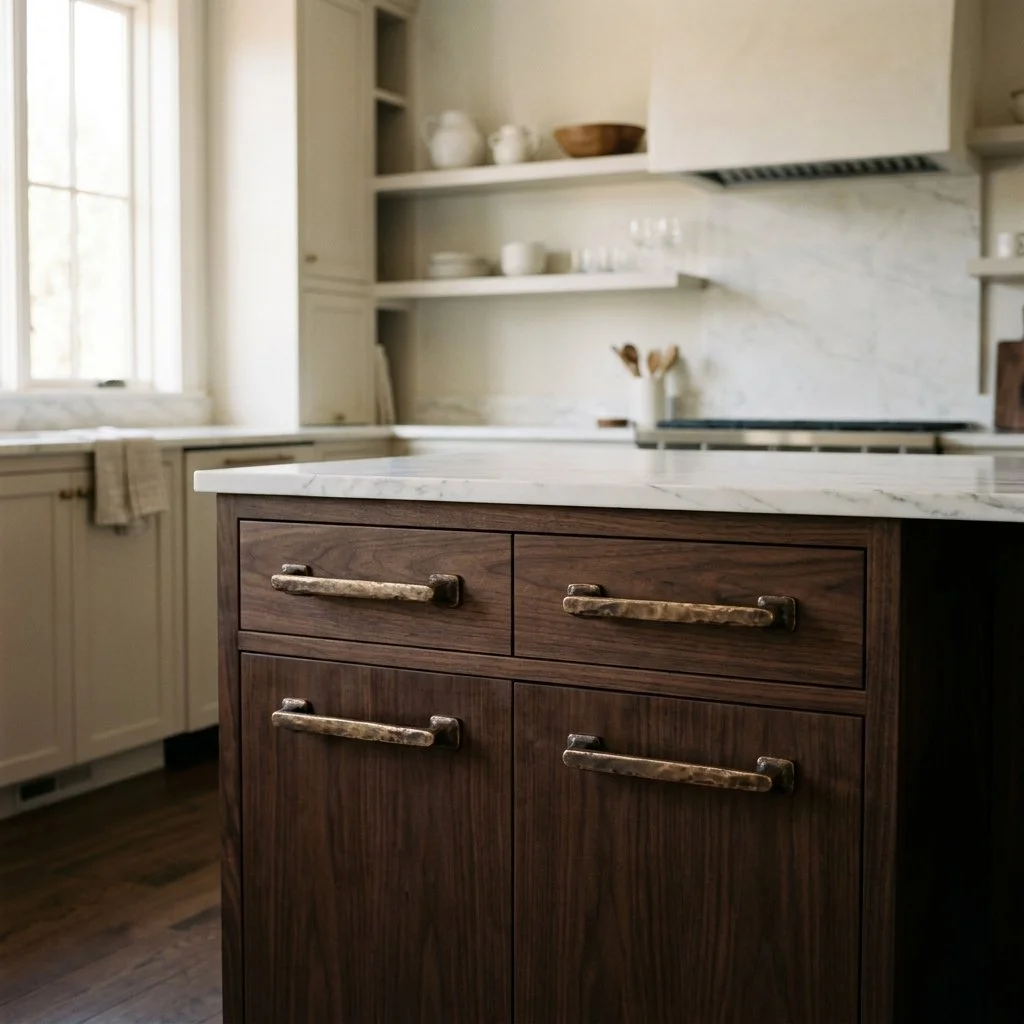
Solid cast bronze cabinet pulls with a warm, natural patina set against a modern kitchen background.
Naked Metal, On Purpose
What I use is sometimes called a living finish: bronze with nothing sprayed over it, sold and installed exactly as it comes off the cast. New, it has a warm, almost gold cast. Within weeks it starts reacting, first to the air, then to the specific hands that touch it every day. I choose that reaction on purpose. It's the whole reason to pick the material in the first place.
The Map Your Hands Draw
Every pull of a drawer or turn of a handle leaves a trace. Skin carries oils and a faint natural acidity, and where it makes contact often enough, the friction keeps burnishing the surface bright even as the copper in the alloy starts to oxidize. The spots nobody touches, the underside of a pull, the back edge of a handle, darken instead, sometimes to a deep, almost black brown. Give it a year and a bronze handle on a busy pantry door will look different from the one on a guest bathroom that barely gets opened. The house starts keeping its own record of how it's actually used.
Bronze or Brass, and Why It Matters Less Than You Think
A fair amount of hardware sold as bronze is technically brass, an alloy of copper and zinc rather than copper and tin. Retailers use the two names loosely, and I'm not going to pretend the industry is precise about it. What actually determines whether a handle ages this way is simpler: a real copper alloy, left bare, with no lacquer standing between your hand and the metal.
Solid bronze door handle mounted on a dark wood door, featuring a bright burnished grip and a deeply oxidized, dark brown patina on the untouched edges.
The Weight You Feel Before You See It
Cast bronze and brass are noticeably heavier than the zinc alloy most inexpensive hardware is made from, and you feel that difference the first time you close your hand around it. It's cool against the skin longer than a lighter alloy would be, and it doesn't rattle or flex the way stamped hardware sometimes does. That density comes from what a solid casting actually weighs, and it's part of why the piece feels permanent rather than applied.
Let the House Keep Score
Quality here means choosing a material that looks better in ten years than it did on day one, because the people living with it made it that way. A living bronze handle is a record of a house being used exactly as it was meant to be, and it only gets more honest with time.
Tzalam and the Living Grain
In a home, furniture isn't an accessory, it’s a legacy. Discover the dense, oily grain of Tzalam and why it is the anchor for a room designed to last a century."
I found Tzalam on a trip through Mexico, propped in the back of a small furniture shop outside Guadalajara. I mistook it for walnut right away. The color was close enough that I didn't think twice. The shop owner set me straight before I'd even finished asking the price, and the real story turned out to be better than the one I'd assumed. Tzalam isn't walnut. It never has been. The name rode in with the furniture trade, not the tree, and it's stuck around because it's a good shorthand for a color everyone already recognizes.
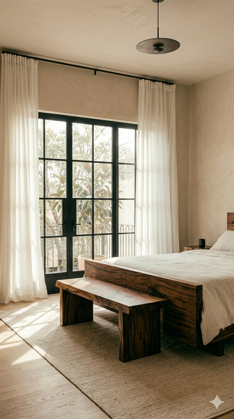
Tzalam wood bedframe and matching bed bench, in a bedroom of natural sunlight.
A Legume, Not a Walnut
Tzalam comes from Lysiloma, a genus in the legume family. Its nearest relatives in the wood world are trees like mesquite, not anything in the true walnut family. Legume woods tend to grow dense and tight grained, and Tzalam holds to that pattern. A board foot runs about 4 pounds, close to 14 percent heavier than red oak, with a specific gravity around 0.63. Pick up a Tzalam side table and a walnut one of the same size, and the difference registers in your arms before you notice anything about the grain.
The Color Does the Convincing
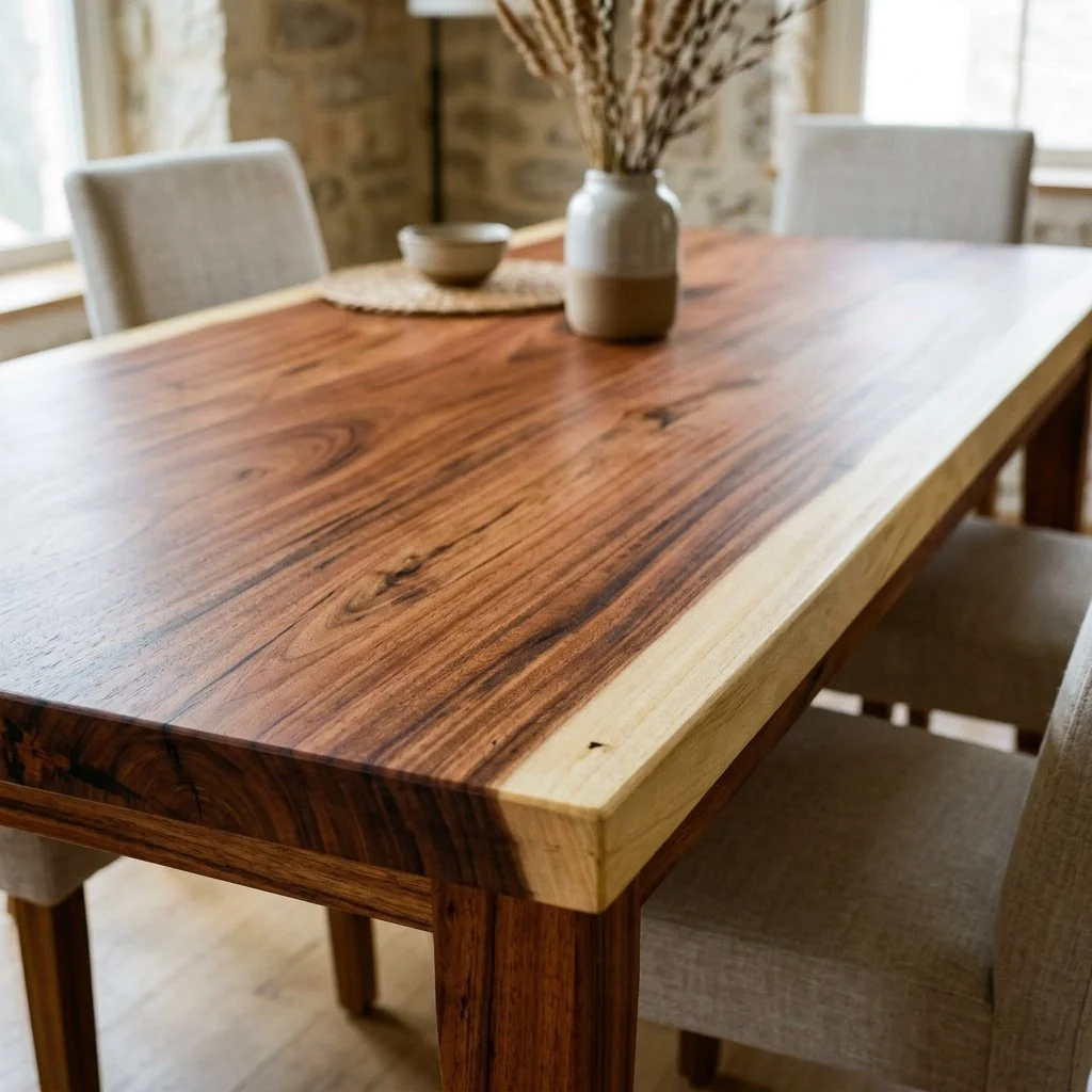
The confusion makes sense once you see the wood. Heartwood ranges from light to medium brown, often carrying a reddish or purplish cast, with darker brown streaks running through it. Set next to true walnut's cooler chocolate tone, it's close enough to fool a showroom floor. What walnut doesn't have is Tzalam's sapwood: a pale, almost gray white band that stops dead against the heartwood with no gradual transition at all. On a slab that keeps its natural edge, that line reads like it was drawn with a ruler.
Built to Outlast a Trend
Tzalam grows in the humid forest belt running through the Yucatan and into Guatemala, usually as a short, spreading tree, its trunk rarely more than two or three feet across, clear of branches for about 25 feet before the canopy opens. What it lacks in size it makes up in resistance. Tzalam carries very high natural rot resistance, which is why it shows up as often in exterior furniture as it does indoors. A table isn't going to face weather the way an outdoor piece does, but the same density that resists rot also resists the dents that mark up softer woods first. A mark on Tzalam tends to sit on the surface rather than crush into it.
Letting the Wood Finish Itself
I don't reach for a heavy varnish on Tzalam, and it isn't because the wood is unusually oily, the way teak is. It's that Tzalam's grain is tight enough, and its natural sheen strong enough after a fine final sanding, that a thick topcoat just buries something that was already working. A wax finish, applied thin and buffed by hand, lets the actual surface of the wood show instead of a film sitting on top of it. The wood does blunt tools a little faster than a softer species would. That's the tradeoff for density, and it's a fair one.
A solid Tzalam wood dining table displaying rich, reddish brown streaked heartwood accented by a distinct, pale live edge sapwood border.
The Room It's Built For
I've used Tzalam on a heavy pivot door in this house before, where the priority was structural weight and rot resistance holding against the elements. In a table or a bench, the same wood does different work. Its warm, reddish brown reads as the anchor in a room built mostly from lighter stone and pale walls, and that stark sapwood line gives a piece with its natural edge left on a kind of honesty a uniform veneer can't fake. It isn't decoration standing in for the tree. It's the tree, cut and finished. It still shows exactly where the bark used to be.
What the Name Doesn't Tell You
Next time a showroom points you toward "the walnut" and it's actually Tzalam, let it go the way I did. The name isn't going anywhere. What matters is knowing what's actually in front of you, starting with where it grew and how dense it is. The sapwood line makes the rest obvious. For a finished piece, look to a trade showroom that carries case goods sourced from Mexico and Central America. It's usually labeled correctly there. For something built to order, that conversation belongs with an importer who specializes in Central American hardwoods, not a domestic mill. That's the difference between furniture you bought and furniture you understand.
The Leather Patina
Most luxury surfaces are designed to stay perfect, we prefer surfaces that learn. Discover the art of the leather patina and why friction is the ultimate finish.
Most leather sold for furniture has been engineered to do the opposite of what leather actually does. The hide gets sanded down to erase its own marks, a uniform grain is pressed back into the surface, and a pigment coat goes over the top. What's left behind can sit in a showroom for a decade without visibly changing. That is the entire point of the process, and it is exactly why that leather will never develop the kind of surface that gets better instead of worse.
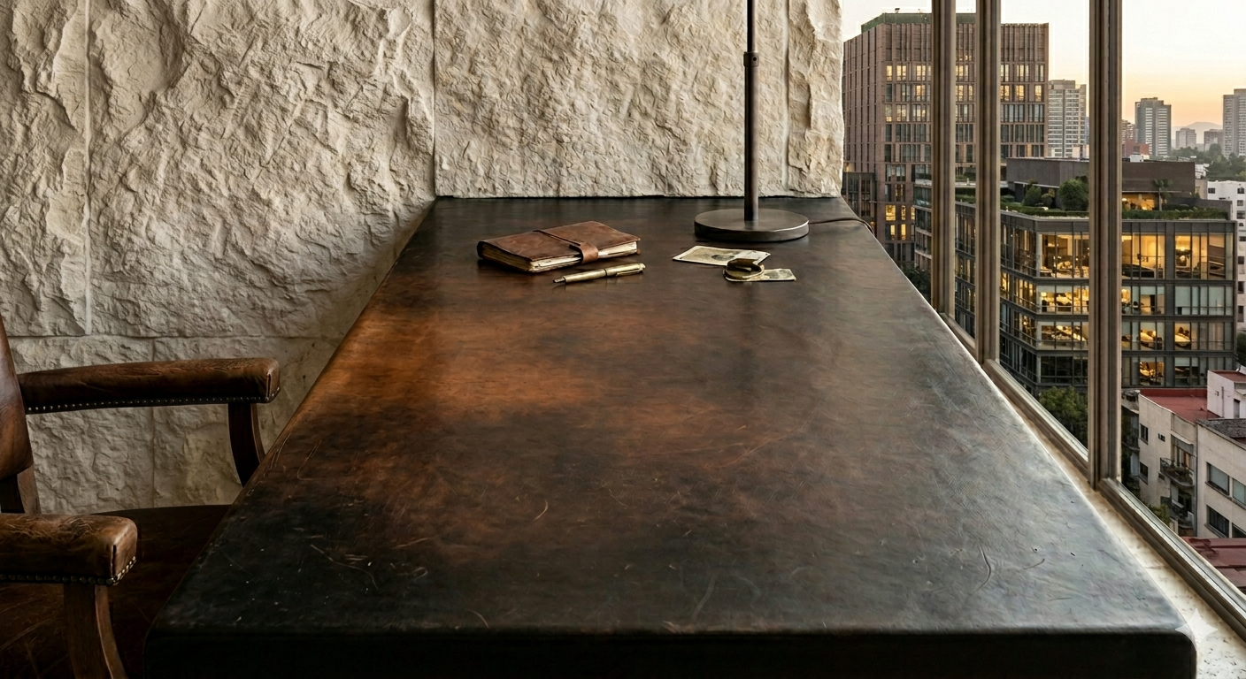
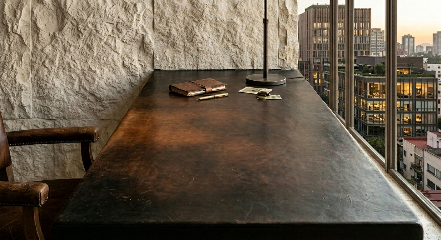
Dark leather wrapped desk.
The Hide That's Allowed to Show Its Age
The leather I use for the surfaces you actually touch, desk tops, door pulls, bench seating, is dyed with soluble aniline dyes rather than coated in pigment. Nothing sits on top of the hide to hide it. Scars, insect bites, faint wrinkles from the animal's own skin stay visible, because there's no artificial layer built to cover them. That openness is also why the surface can keep changing for decades after it leaves the tannery. Corrected leather, sanded, embossed, and finished with a coat of pigment, is what fills most standard showrooms. The layer reacting to your hand there is a manufactured skin sitting on top of the real one.
What Touch Actually Does
Rest your hand on a leather desktop often enough and something starts happening to it that goes deeper than the surface. The oils in your skin work into the open pore structure and deepen the color underneath your palm. Sunlight slowly oxidizes the natural tannins across the whole surface, warming a lighter hide toward amber over a matter of years, not days. And the physical contact itself, the pull of a handle, the drag of a forearm across a desk, polishes the surface smooth at a level you'd need a microscope to actually see happening.
Tanned to Age, Not Just to Last
The leathers that do this best are tanned with bark tannins, oak, chestnut, quebracho, in a process that hasn't changed much in centuries. The tannins bind directly to the hide's fibers, which is why vegetable tanned leather darkens and softens with use instead of simply wearing out. Chrome tanned leather, treated with mineral salts, gets soft faster on the shelf but never develops that same depth of color. It stays close to whatever shade it started at.
For the pieces built to carry real weight, a desk edge, a bench seat, a stair railing, I look for saddle leather specifically, hide cut thick from the sturdiest part of the animal, historically reserved for harness and tack because it had to hold up under load for years without failing. The palette stays narrow on purpose. A pale tan can read as merely faded after a few years of light. A deep, cured hide in burnt honey or blackened espresso reads as older instead, which is a different thing entirely.
Leather merchants in Florence have an old habit. They leave new wallets in the shop window for weeks before selling them, so the sun starts the aging process before a buyer ever touches it. Nobody asked them to do that. It's just what the material rewards.
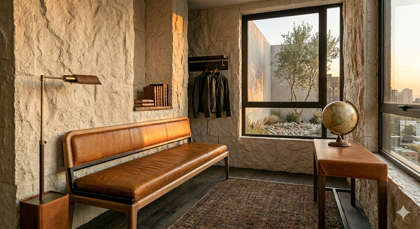
Leather sitting bench in a burnt honey color.
Wear It In
Most of the industry still treats a decade of scuffing as something to hide. I treat it as the whole point. A leather railing or library chair that's been used hard for a decade develops a depth of color no tannery can replicate in a vat, no matter how good the dye. It stops behaving like a product somewhere in that decade and starts behaving like an heirloom, the kind of object a house accumulates rather than furnishes with. Choosing this leather means treating your own house like something you live in, not something you're borrowing. Your life is what finishes the piece.
The Mineral Palette
In a sanctuary, color isn't something you apply, it’s something you reveal. Discover why we move away from synthetic paint and toward a permanent foundation of Bone, Sand, and Silt.
I used to think a mineral palette meant a mood board of stone photos: bone, sand, silt, done. Then I started asking why those colors actually happen, and the answer kept coming back to the same word.
Pure limestone is white. Calcite, its main mineral, carries no color of its own. Every buff, tan, and honeyed tone you've ever called "natural stone" got there because something else rode along in the rock for a few million years: iron.
Rust on a nail and warmth in a limestone slab are the same chemical event. Iron reacts with oxygen and turns some shade of red, orange, or brown. How dark it goes depends on how much oxygen it got and how long it had. Once you know to look for it, the same reaction turns up in fired clay and troweled plaster as often as it does in stone. A mineral palette isn't dozens of unrelated materials that happen to look good together. Most of the warmth in it is one element, working the same job in different disguises.
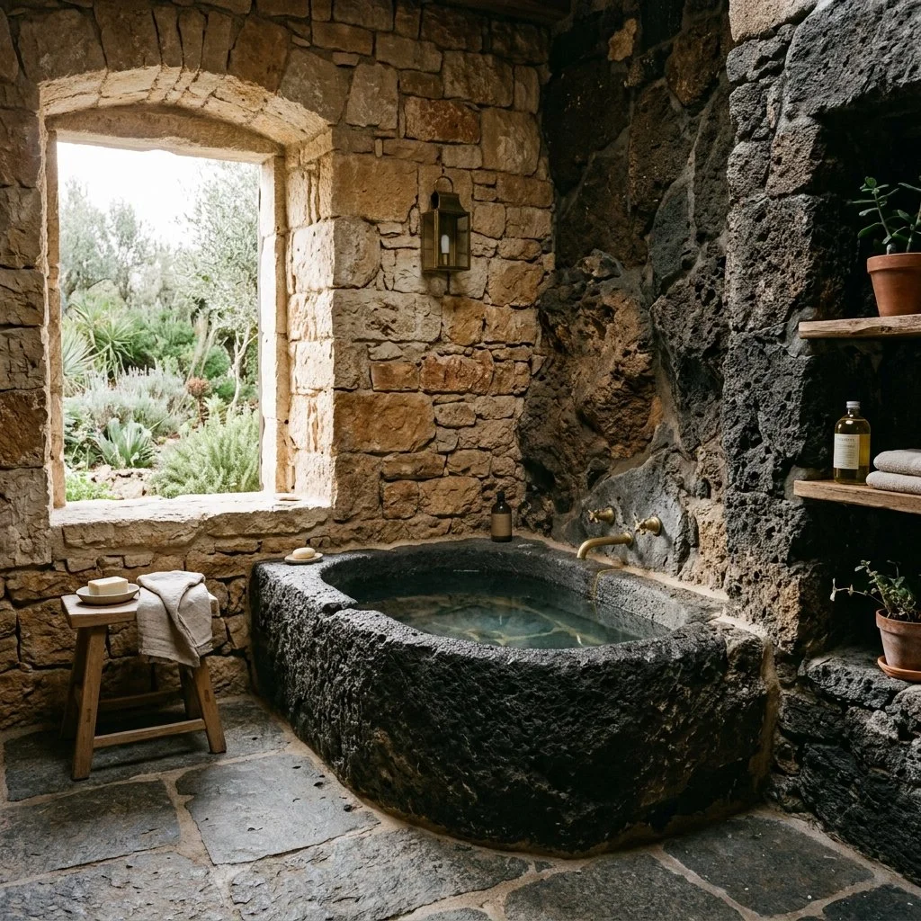
Stone bathroom, volcanic rock, carved bath, with limestone walls.
What the Same Reaction Looks Like in Three Materials
In limestone and travertine, iron oxide is an impurity, not the main event. The base rock is mostly calcium carbonate; a small amount of hematite or goethite mixed through it pushes the color toward buff, gold, or a deep reddish brown. Organic matter trapped in the same layer pulls it the other way, toward gray and black instead. Two slabs from the same quarry can read completely differently. It comes down to which one happened to trap more of each.
Basalt starts out dark, colored by the same iron and magnesium minerals that make it dense. Left outside, it weathers. The iron in it oxidizes into hematite, and the surface slowly turns brown. It's the identical chemistry as a limestone's warm streak. This time it's just running on stone that started dark instead of light.
Terracotta gets its red the same way, on purpose. Potters choose a clay body high in iron because firing it in a kiln rich with oxygen turns that iron a deep rust red. Starve the same clay of oxygen during the firing, or start with a body low in iron, and the color shifts toward gray or black instead. The kiln isn't creating a color. It's deciding how much of the iron already in the clay gets to show.
It even turns up somewhere you wouldn't expect: the aubergine veining running through Calacatta Viola marble is the same iron oxide, distributed as fine mineral streaks instead of a uniform stain.
What Happens When Iron Isn't the Story
Not every dark or cool tone traces back to an absence of iron. Obsidian is volcanic glass, cooled from lava so fast that no crystal structure ever forms. Its black has nothing to do with oxidation. It comes from the glass itself, the way a dark beer bottle is dark without any iron involved. But even obsidian isn't immune to the pattern. Mahogany obsidian gets its swirl of red and black from the exact same hematite inclusions, proof that iron finds its way into almost anything molten enough to carry it.
In limestone and marble, the cooler grays and near black tones usually trace back to carbon and organic matter trapped during formation, not to iron's absence. Two impurities, two directions. One warms the stone. One cools it. Most quarries carry some of each in the same face.
Why Lime Plaster Actually Glows
The claim that limewash "glows" usually gets left as decorating language, but there's a real mechanism behind it. Limewash cures through carbonation: calcium hydroxide reacts with carbon dioxide in the air and forms calcite crystals directly on the wall. Those crystals have a dual refractive index. Light entering one gets split and reflected back twice. Ordinary paint just bounces light off a pigment particle once. That's the actual source of the glow people notice on a limewashed wall at dusk. It isn't a metaphor. It's a different physical process than the one happening on a painted wall beside it.
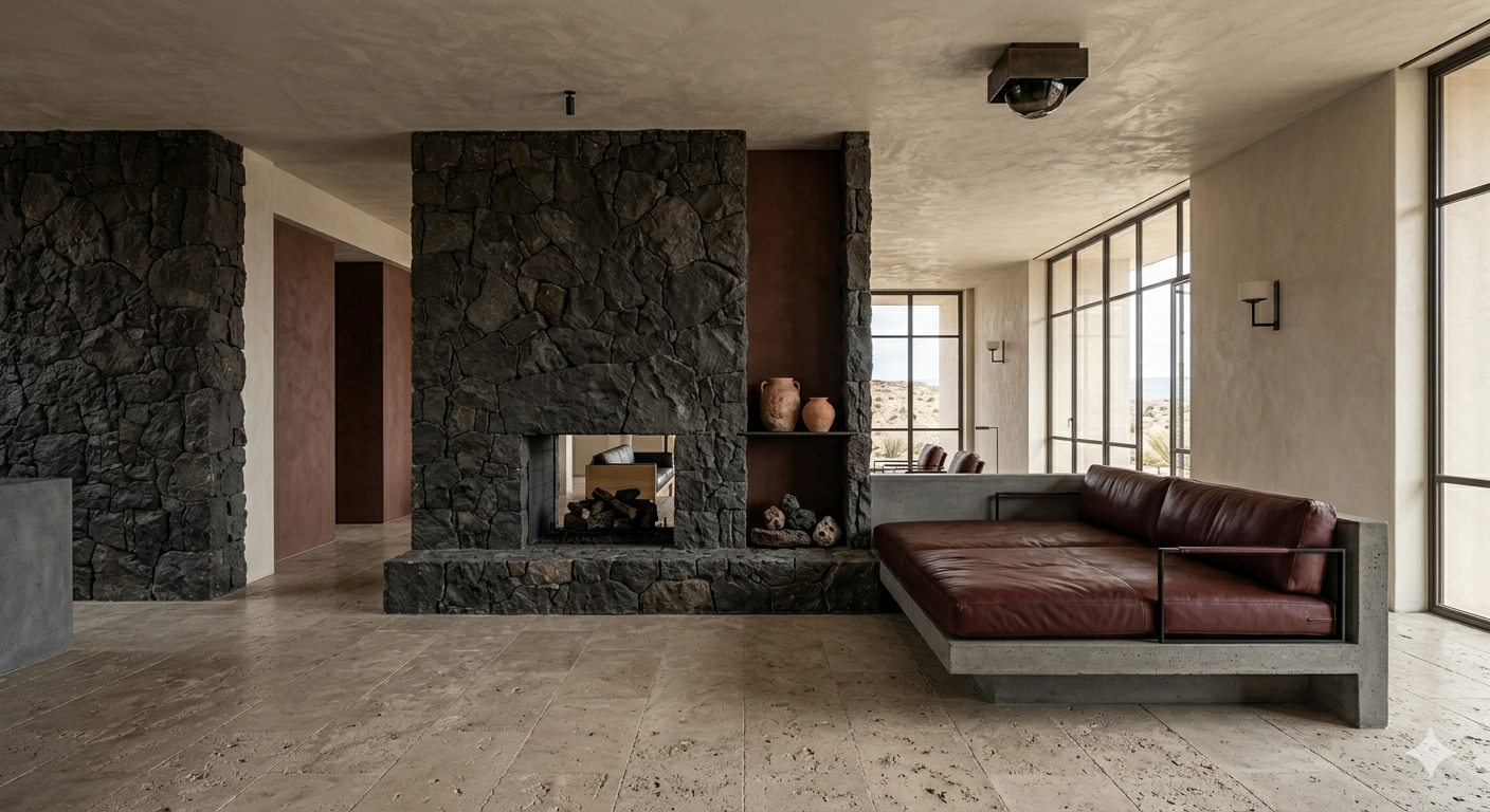
Expansive living area, stone floors, volcanic rock fireplace, limestone walls and celling.
Consistency Is a Chemistry Decision, Not a Mood Board One
Once you can see iron oxide, or its absence, as the actual variable, matching materials gets simpler. I look at a room's materials and ask one question first: what's actually coloring each one. A room built from stone, clay, and plaster all warmed by iron stays in one family no matter how many different materials are on the list, because they're all running on the same underlying chemistry. Mix in a marble darkened by carbon, or a true black basalt, and you've introduced a genuinely different mineral story, not just a darker paint chip. That's the real reason some earthy rooms feel coherent and others feel matched by eye against a fan deck. One is tracking an actual element through different materials. The other is guessing.
Match the Chemistry, Not the Chip
Strip away the marketing language and a mineral palette comes down to minerals doing what they've always done. Iron reacts with oxygen and warms whatever it touches. Carbon does the opposite; trapped in stone, it darkens instead. Calcite splits light because of its own crystal shape, which is the real reason plaster glows and paint doesn't. None of that was designed to feel expensive. It's old enough, and consistent enough, to read as inevitable in a room. Before matching two materials on a mood board, I want to know what's actually coloring each one. Materials running on the same iron reaction hold together no matter how different they look on paper. Pair iron against carbon, and no amount of squinting at swatches will make them agree.
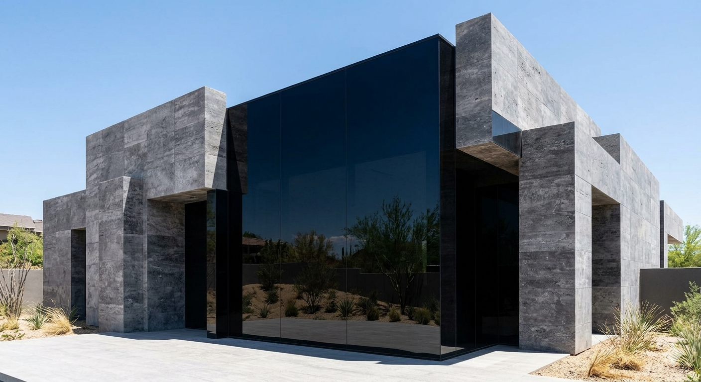
The Glass That Doesn't Want to Disappear
Most homes treat glass like a void. We treat it like a material. Discover the power of 'Obsidian Light' and why the right glass should feel like a protective lens, not a fishbowl.
Most glass walls sold as luxury do the one thing you actually don't want. They disappear completely, and a house built entirely on disappearing walls stops feeling like a house and starts feeling like a display case. I want glass that holds its ground. Dark enough to read as a material of its own. Engineered so well you forget it's filtering anything at all. I think of the good version of this as obsidian glass, heavy enough to read as stone, still unmistakably glass.
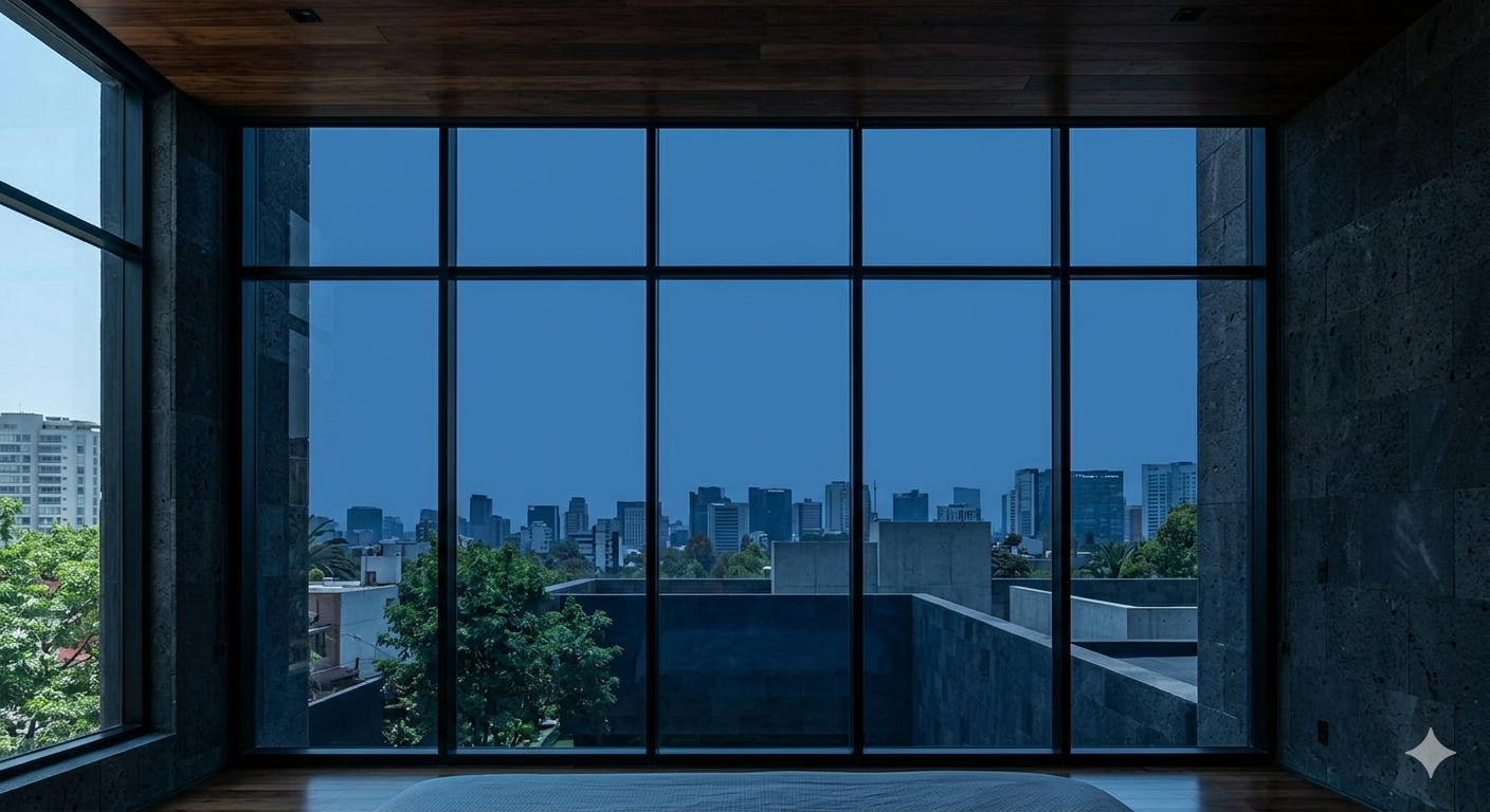
Obsidian Glass lens over the Polanco skyline.
What Clear Glass Actually Costs You
Ordinary clear glass lets through close to ninety percent of visible light and stops very little of the sun's ultraviolet. That's a fine trade in a climate with real winters and a low, forgiving sun. It's a slower problem somewhere the sun is a constant, aggressive presence for most of the year. Walnut floors bleach unevenly along the sightline of a window. Limestone gets warm enough underfoot by early afternoon that you notice it. And once the lights are on inside at night, clear glass turns into a mirror that shows you your own living room instead of the view you paid for.
Dark glass that keeps its color honest solves several of these problems with the same piece of material. It can cut visible light transmittance dramatically, in some cases below ten percent. It also blocks most of the ultraviolet radiation actually responsible for fading fabric and wood, not the visible light itself. The heat drops along with it. I've stood against a wall of this glass at noon and felt almost nothing come through.
A Lens, Not Just a Tint
The failure mode with dark glass is a cheap tint, the kind that turns everything on the other side of it blue or bronze. Oak looks cold. White walls read faintly green. It stops being a window and starts being a color filter you have to mentally correct for.
Real architectural glass solves this with coatings engineered specifically to stay neutral, gray or charcoal formulations built so a white wall still reads bone white and a plank of oak still reads warm, seen through several inches of very dark glass. The industry term for it is solar control low-E glass, and the good versions are labeled neutral reflective rather than just tinted. Color goes through intact. Only the glare and the heat get filtered out.
Built to Look Solid From the Street
From the outside, this glass shouldn't read as a hole punched in a wall. It should read as a dark, continuous plane, close in visual weight to the stone beside it. Architects get this partly by pairing the actual windows with opaque glass panels of matching color over the structural floor lines and mechanical gaps, so the whole facade reads as one uninterrupted surface instead of glass here, wall there. It's a real technique with a real name, spandrel glass, and getting the match right is harder than it sounds since transparent and opaque glass reflect light differently in different weather. Done well, the house looks carved from one piece of dark rock rather than assembled from parts.
That solidity buys you something practical too. During the day, with the light balance working in your favor, nobody on the street can see in. You get the privacy of a solid wall with the specific pleasure of a window.
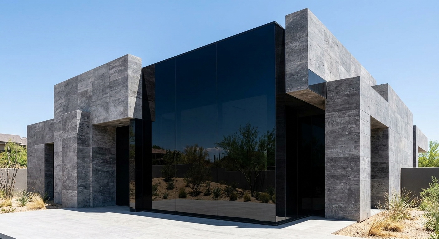
Massive, dark "slab" of obsidian glass reflecting the street side landscape.
Frames That Get Out of the Way
None of this works if the frame fights the glass for attention. A wall this dark and this heavy needs a structural system, not a hardware store window kit. The better structural glazing systems now bond the glass in rather than resting it in a groove, which lets the glass itself carry part of the load. That's how the best of them get vertical sightlines down to a couple of millimeters instead of a couple of inches.
Steel or aluminum in a matte black finish, kept as slim as the glazing system allows, disappears into the shadow line of the wall. You look at the window and see the view. I'd rather deal with a harder installation now than live for twenty years with a frame that competes with what it's supposed to be showing you.
You Choose What Gets Through
Glass doesn't have to be invisible to be good. Dark, honestly colored glass in a frame that gets out of the way is a decision about exactly how much of the outside world you want in the room at any given hour, made on your behalf so you never have to think about it again. That's a higher bar than a window that lets everything through just because it can.
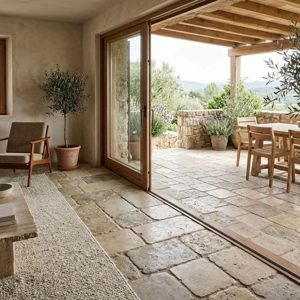
The Grit of the Floor
High gloss stone is a signal of excess, not elegance. A home should not feel like a hotel lobby. Discover why the Madison Prime Home standard prioritizes 'grit', the tactile connection between the foot and the foundation.
A fabricator honing a slab doesn't grind until the stone looks good. They grind until they hit a number, then they stop. Most honed finishes end somewhere between 200 and 800 grit, commonly around 400. A polished finish keeps going, all the way to 1,500 or 3,000 grit, closing the stone's surface until it throws back a reflection. The difference between the two floors in your house isn't taste. It's where the machine stopped.
There is a common mistake in high end residential design: chasing the mirror finish because it photographs well and reads as expensive on a walkthrough. Polished stone at floor level is reflective and cold underfoot. Wet, it turns dangerously slick. Worse, it reads as commercial. It's a hotel lobby, an airport concourse, a space built for people passing through, not living in it.
I think a floor should be an anchor. It should have grit, both kinds. The literal kind, and the kind that means something has weight and won't be talked out of it.
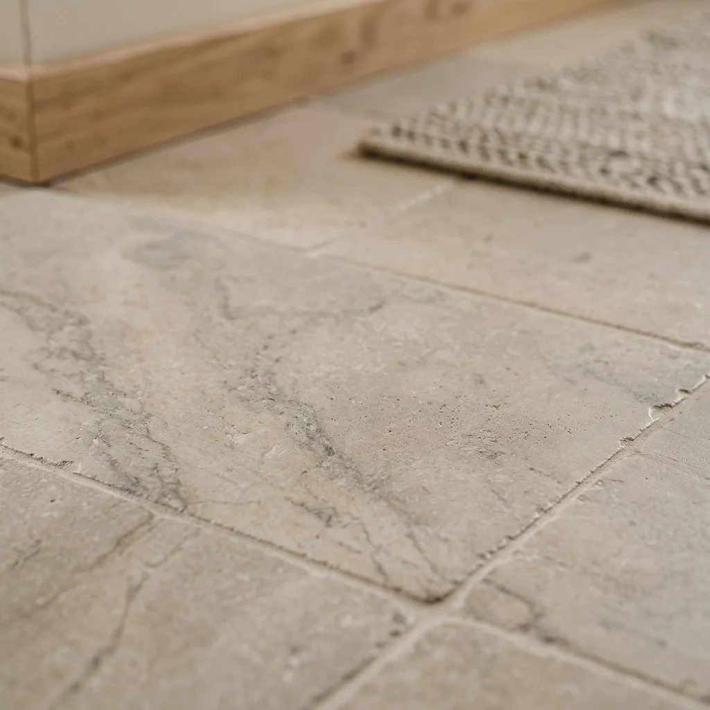
Honed limestone flooring highlighting its soft, matte surface and natural veining.
What the Foot Knows
Walk barefoot across a honed or leathered tipped floor and it feels like the earth, not a sheet of glass. That's not only sensation. Texture absorbs light instead of throwing it back, which is part of why a matte floor makes a room feel settled instead of staged. This is the same instinct that runs through the mineral palette of a house, where the raw, earthbound tones of a material are allowed to set the mood instead of getting polished out of it.
The Honed Finish
Honing is the baseline for a serious floor. A fabricator runs the slab through a sequence of progressively finer diamond abrasives and simply stops before the final burnishing stage that closes the stone's surface to a shine. The result is flat and matte, with none of the glare that would wash out a marble's veining or the fossil fragments locked into a limestone. It also feels different underfoot: soft, not slick. And it ages better. A polished surface shows every scuff against the gloss. A honed one absorbs them.
The Leathered Grain
Leathering goes a step further. Rotating diamond brushes wear into a stone's softer minerals and glide over the harder ones. What's left is a rippled, almost pebbled surface, the reason people reach for the word leather to describe it. It's the most forgiving floor there is. Fingerprints and water spots disappear into the texture, and so do the small scratches that come from actually living in a room. The grip underfoot is real, not decorative.
The Tumbled Edge
For the threshold between an interior room and a terrace, I look for a tumbled or brushed finish. Barrel tumbling with abrasive media and water rounds the edges and softens the face of the tile until it looks like it's been walked on for a century. It trades the precision of a fresh cut for something closer to the truth of a floor laid by hand.
Grip Before Gloss
Slip has a legal minimum, and a mirror polished floor often misses it. ANSI A137.1 sets the wet dynamic coefficient of friction, DCOF, at 0.42 minimum for a level interior floor that might get walked on wet. Anywhere bare feet are likely, a pool deck, a shower floor, a bath, the recommended minimum climbs to 0.60. A floor polished to a high shine routinely tests below that first number when wet. A honed or leathered surface tests well above it. This is the part of "grit" that has nothing to do with how a room photographs and everything to do with whether someone falls in it.
Tumbled stone floor tiles at the transition from an indoor living room to an outdoor terrace.
What Holds the Floor
Honed limestone is the standard I come back to. It's dense enough to perform, but the surface reads warm rather than clinical, which matters when it's the thing your feet meet first thing in the morning. Stone also carries real thermal mass, which is why it pairs so well with radiant heating systems: it absorbs warmth evenly and releases it slowly, instead of running hot in one spot and cold in the next.
Leathered basalt or granite earns its place in mudrooms and anywhere else that sees heavy daily traffic, but the two behave differently under a boot for a real reason. Basalt is an extrusive rock, formed at the surface as lava cools fast, which gives it a tight, even grain and a Mohs hardness around 5 to 6 across the whole slab. Granite is intrusive, cooled slowly underground, which lets its minerals grow large enough to see: hard quartz next to much softer mica and feldspar. That unevenness gives granite its movement, but it also means it can wear unevenly over decades. Basalt just wears the same, everywhere, for longer.
Honed, unfilled travertine is where I land for a floor that wants some age to it. The natural surface pitting comes from the same trapped gas that shaped the stone in a wet room built for the long term, but on a floor, left open and honed rather than filled and glossed, it does something different: it gives bare feet a texture to actually read, not just look at. Sealing a floor like this belongs to ongoing care, not to this conversation.
What You're Actually Standing On
A house is only as steady as the ground beneath it. Choose a floor with texture and you're choosing a material that's honest about where it came from and what it's made of. A polished floor is a display. A textured one is a foundation. I'll trade the shimmer of a trend for the grit of something that holds.
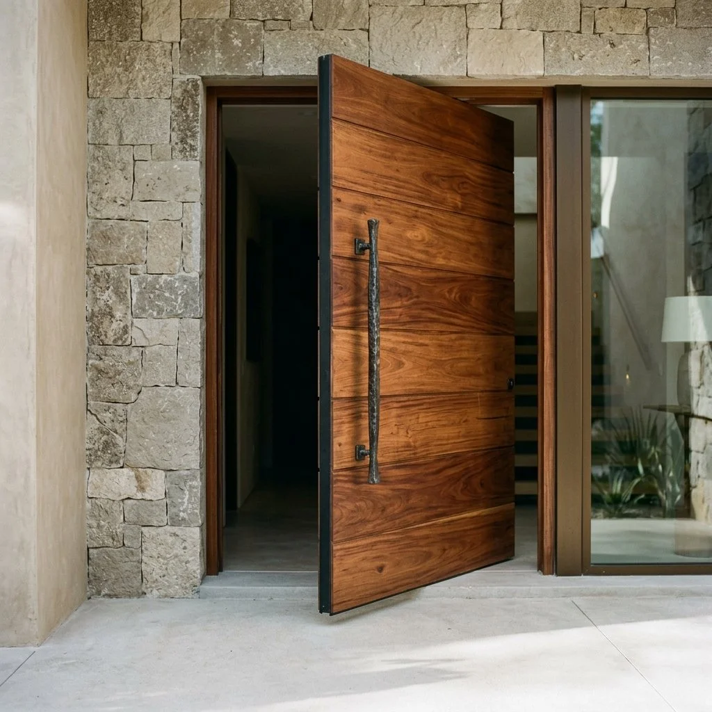
The Heavy Door
A great house starts with how it feels to walk through the front door. It’s a change in the air, a sudden drop in noise that tells your brain you’ve left the street behind. Discover the Three Point Check for engineering a silent, high gravity threshold.
Most front doors announce themselves twice. Once when they close, and again a few months later, when they start to drag or bang against the frame. A door heavy enough to matter does neither. It closes low and even, with nothing hollow in the sound, and it swings the same way five years in that it did the day it was hung.
That's not a finish problem. It's a hardware problem, and it starts below the door, not on its face.
Wide plank Tzalam wood pivot entrance door open against a limestone facade, anchored by a forged blackened bronze handle.
What a Hinge Can't Carry
A standard butt hinge is mounted to the side of the frame, which means every pound of the door hangs off a few screws driven into wood. Past a certain width, usually around four feet, that frame starts losing the argument. The door sags at the top corner first, then drags at the bottom, then needs planing every year to keep closing at all.
A pivot solves the actual problem instead of masking it. It mounts at the top and bottom of the door rather than the side, and it sends the door's full weight straight down through a bearing set into the floor. Floor mounted pivot systems are rated for doors well past a thousand pounds, with no meaningful limit on width, because the floor is doing the work a frame was never built to do. That's how a slab of solid wood or stone that weighs close to five hundred pounds still opens with one finger and closes on its own with a soft, even thrum. Nothing about that is luck. It's the pivot, and it's the first hardware decision I make on any door wider than four feet, before wood or finish enters the conversation.
A Core Built Like a Wall
The other half of that sound is the door itself. A door with a hollow core reads as hollow no matter what veneer sits on the outside, because there's nothing behind the skin to absorb an impact. I check this with a knuckle before I ask what species the veneer is, because no finish fixes what's missing underneath. A real entrance door runs a solid core close to four inches thick, often built around an aluminum honeycomb structure for rigidity, then clad in heavy timber. The honeycomb keeps the door from twisting under its own weight. The timber gives it the mass that actually blocks sound.
An automatic drop seal finishes the job. It sits hidden inside the bottom of the door and stays retracted until the door closes, then lowers to meet the threshold and seals out draft and street noise. Light doesn't slip under it either. It's invisible when the door is open, which is exactly the point. A house doesn't decompress at the door if you can still hear the driveway through the gap underneath it.
Security That Doesn't Look Like Security
A visible keypad or a camera mounted on the trim tells a visitor two things at once: that the house is worth securing, and that the owner cared less about how it looked than about the fact that it was there. The better version hides the same technology inside parts of the door someone would touch anyway. A fingerprint reader built into the underside of a handle. Sensors set into the wood grain instead of bolted to the surface. The door still recognizes you. It just doesn't look like it's doing a job. Between the two, I'll always take the version a guest never notices over the one that makes a show of protecting them.
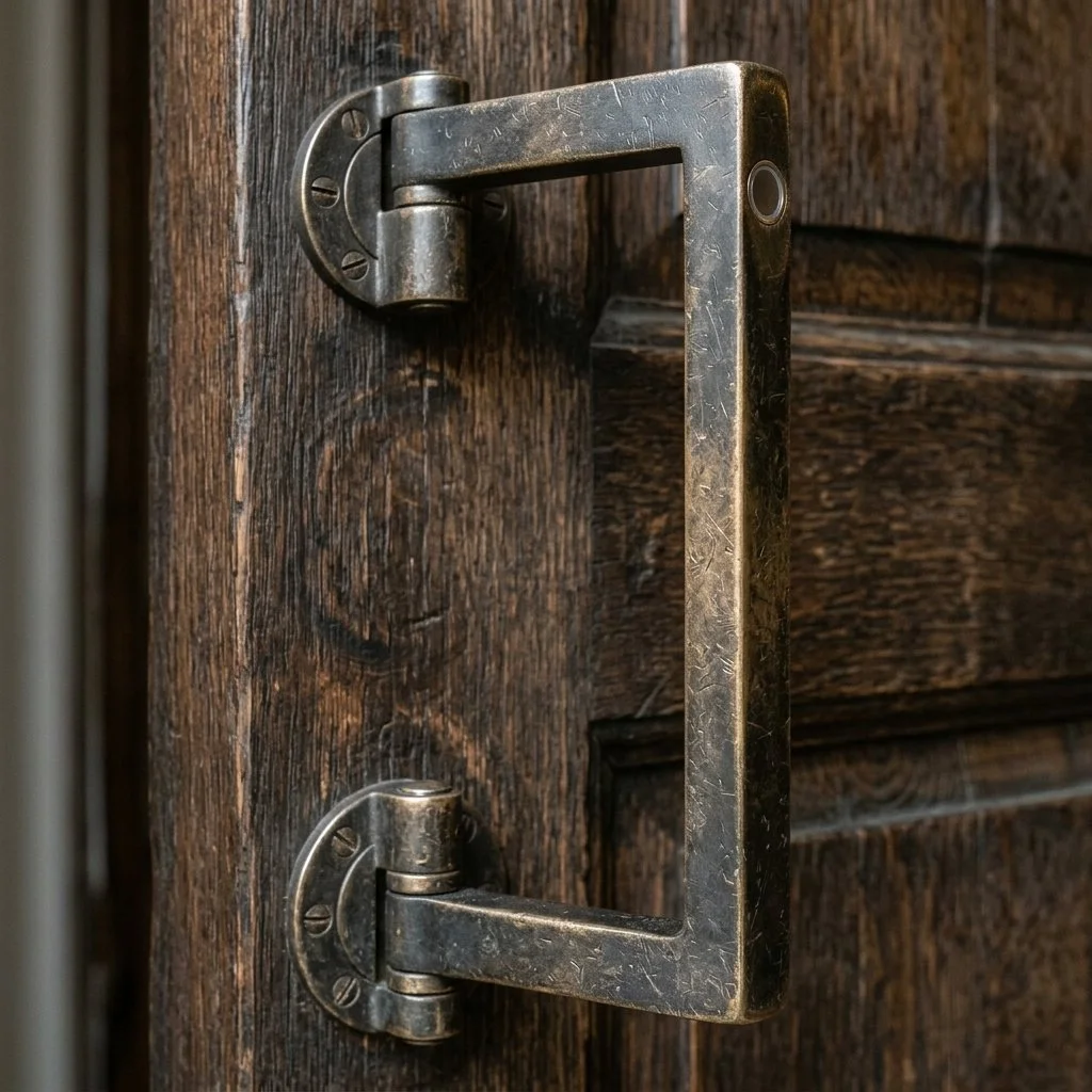
Vertical bronze pull handle on a massive dark wood pivot door, featuring a flush, integrated fingerprint reader set discreetly into the metal.
The Materials That Age Instead of Wearing Out
Tzalam, sometimes called Mayan walnut, runs harder than white oak on the Janka scale and carries a very high natural resistance to rot, which is why it holds up on an entrance that takes real sun and rain without warping or graying the way softer species do. Charred oak gets there a different way, through surface treatment rather than density, and reads darker and more matte against a stone or plaster facade. I reach for Tzalam whenever the design can carry real color instead of a uniform dark surface, and charred oak when the house wants something more restrained.
The handle is the one piece of hardware a person actually touches, which is exactly why I spec forged blackened bronze there even when I'd let something less expensive go elsewhere on the door. It stays cold against the hand the way plated hardware never does. It also changes over years of use. The oils in your skin build a patina on it that a static factory finish never develops.
The First Room in the House
I don't spec any of this to make a door look heavier than it is. The pivot, the core, the hidden lock, the bronze that changes with your hand: every one of them is real mechanical weight doing real mechanical work. A door that passes all four tests sets the standard the rest of the house has to meet. Walk through one that doesn't, and you already know, before you've seen a single room past it, exactly how much of the rest is real.
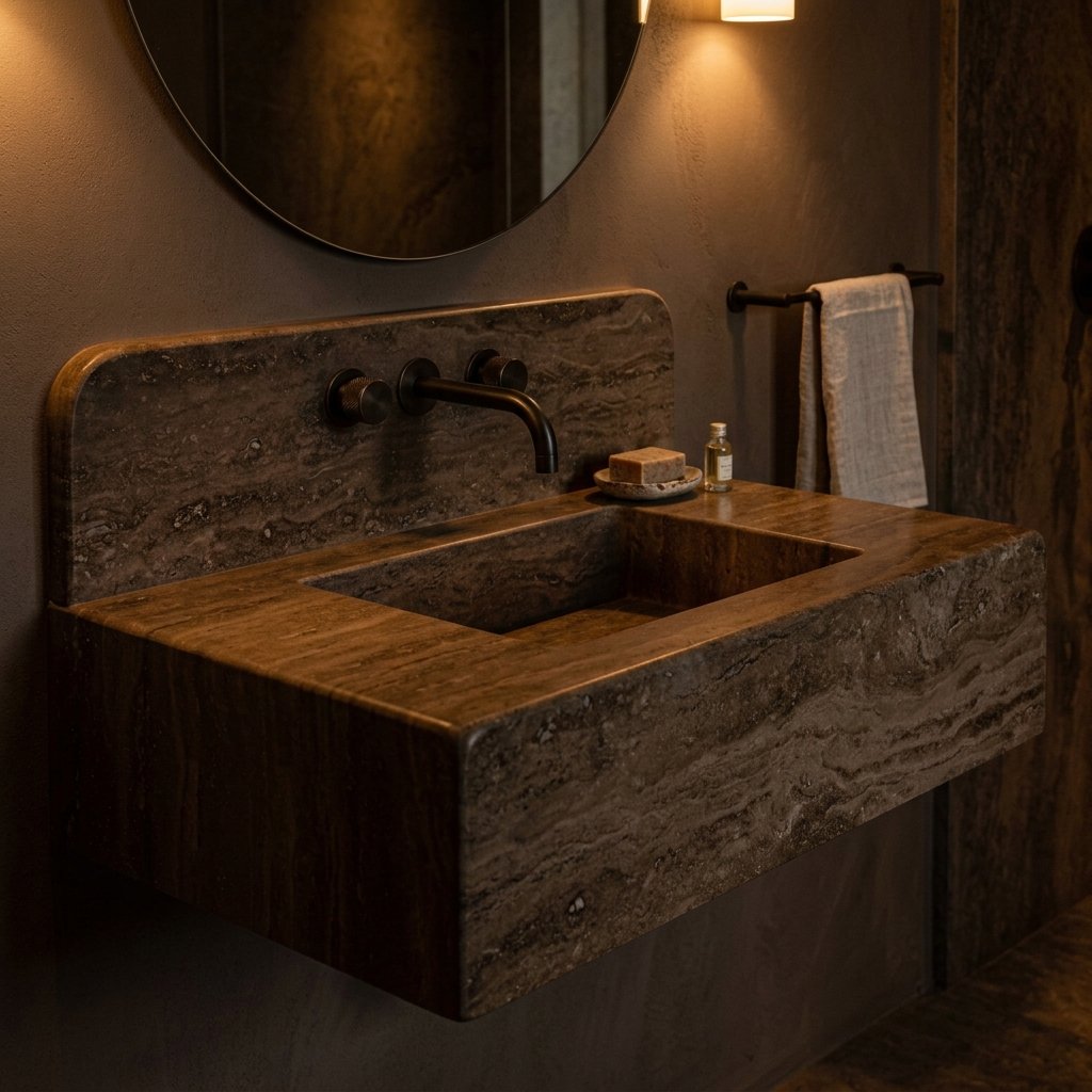
A Bathroom Is Either Built or Installed
Moving beyond utility. Explore the Madison Prime standard for the carved residential bath.
Travertine gets its texture from gas, not water. As water rich in minerals rises to a hot spring's surface and meets the air, it releases carbon dioxide, and the bubbles that escape leave pockets running through every block that forms afterward. What looks like an ornamental surface is really a record of something leaving the stone in a hurry.
Most of what separates a real bathroom from a merely expensive one, to me, comes down to how honestly it treats what the stone actually is. Not how well the room hides it.
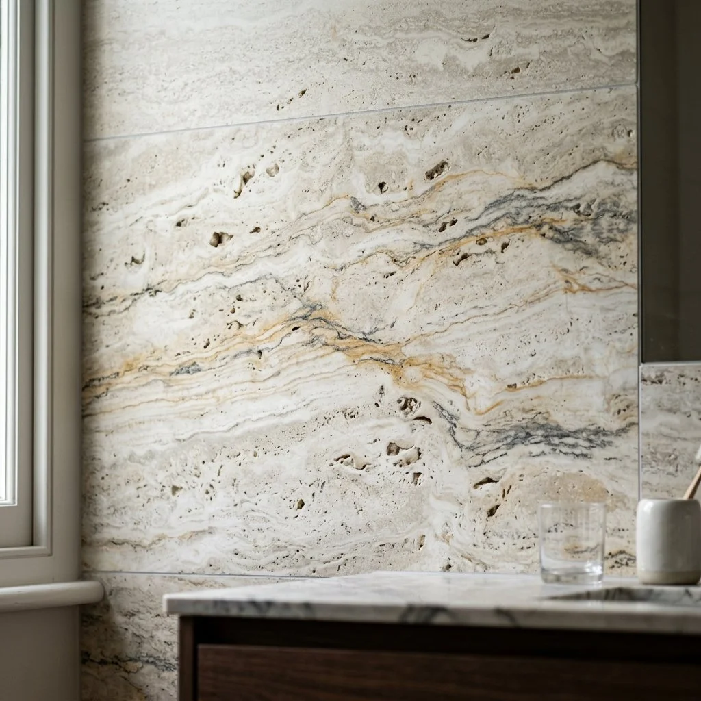
Honed silver travertine bathroom wall panel featuring natural porous texture and oyster, warm ochre, and graphite grey veining.
What the Stone Actually Is
Limestone forms in shallow seas over millions of years, as calcium carbonate from shells and coral compresses into rock. Cut a slab open and you can sometimes find the fossil itself: a shell fragment, or a pinhole where one used to sit. It's dense enough for a bathroom floor and porous enough that it needs sealing before it meets water, a plain fact that gets left out of a lot of showroom pitches.
Travertine is limestone's louder cousin, made the same way but through hot spring water instead of ocean sediment. Denizli, Turkey, the province surrounding the famous white terraces at Pamukkale, has roughly forty working quarries producing much of the world's supply. The protected terraces themselves are never touched. The trapped gas leaves real holes, not a printed pattern meant to look like holes. A fabricator can fill those with resin or grout to match the stone's color, which most professionals recommend anywhere water actually sits, a shower floor or wall, since an open pore in a wet zone collects grime and can hold mold no sealer fully solves. Left unfilled, the same stone reads rougher and shows its formation honestly, a choice that still works on a dry powder room wall or a feature wall outside the spray. It's a real tradeoff tied to where the water goes, not a style preference, and I ask which zone I'm specifying for before I ask which finish looks better.
The Vanity That Doesn't Have Seams
A vanity carved from a single block of stone has no caulk line where the basin meets the counter, because there was never a seam to begin with. The bowl and the deck were one piece of rock before anyone touched it with a chisel. Water runs back into itself instead of pooling at a joint, a small mechanical advantage most people never notice until the version with the seam starts to stain.
It's also heavier than photographs ever convey, and that isn't a small detail to me. A basalt slab vanity barely two and a half feet wide can run over a hundred pounds before a faucet is even mounted. That weight is real evidence of the material behind it. A stone veneer bonded over a lighter substrate can look identical in a listing photo and weigh a fraction of that, which matters the day someone has to hang it on a wall.
Floating vanity hand carved from deep brown, richly veined natural stone with a seamlessly integrated basin.
The Drain Decides the Floor
A center drain pulls the floor toward it from four directions at once, which limits how large a tile or stone slab you can lay without the corners reading choppy. A linear drain only needs the floor sloped one way, at a code minimum of a quarter inch per foot, so a single wide stone panel can run the length of the shower without a seam breaking up the surface. The strainer sits flush and tile-in, finished in the same stone as the floor, so the drain itself nearly disappears into the plane it drains.
That decision, made early with the plumber and not the tile setter, is the one I flag first on any bath, because it decides whether the floor reads as one continuous surface or a floor interrupted by a fixture.
The Room That Admits What It's Made Of
None of this is decoration. The pores are the record of how the stone actually formed, filled or left open depending on where water goes. The seam that was never cut is a mechanical decision, not a style one. Neither is meant to be noticed. Both are meant to work, and to keep working, for longer than most of the fixtures around them. A vanity's weight is one piece of that evidence, not the whole case for it. Whether the stone stays honed or gets sealed against years of steam is a separate conversation, one Care & Preservation covers in more depth. What I actually ask a fabricator, before color or finish, is what the material is doing when no one's looking at it.
The Kitchen Anchor
The modern kitchen has evolved past the era of purely functional zones. Today, the pinnacle of luxury design is defined by the Anchor, a rejection of the temporary.
A mitered edge is a small trick of geometry that fools almost everyone. Two pieces of stone, each about three quarters of an inch thick, get cut at a matching angle of forty five degrees and glued together at the corner. What you see afterward reads as four solid inches, sometimes more, with no seam in sight. Fabricators call the result an apron, and I've watched one built in under a minute. It's the same instinct behind every kitchen I'd actually call an Anchor.
An Anchor is what happens when a kitchen stops being a workspace with appliances plugged into it and starts reading as one fixed piece of the house. Not a set of cabinets and countertops assembled to fit a floor plan. Something built into the architecture that isn't going anywhere.
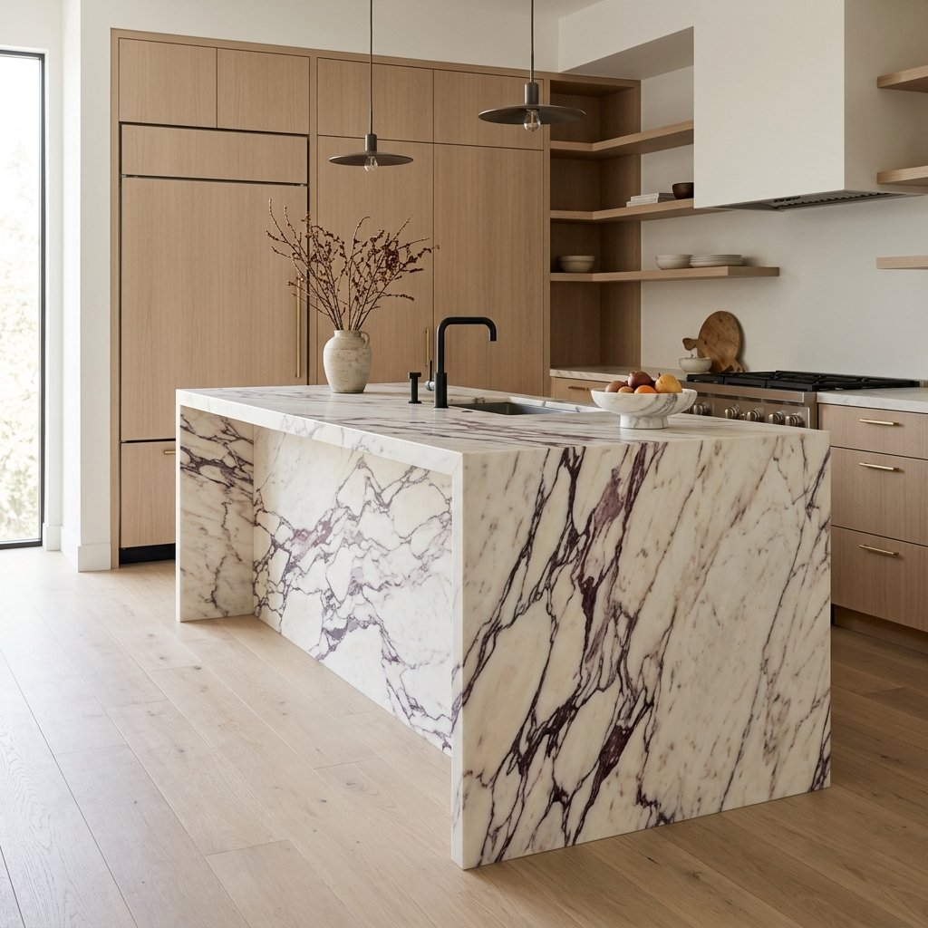
Kitchen featuring a monolithic, honed Calacatta Viola marble island with dramatic violet veining and a seamless waterfall edge, set against custom white oak cabinetry.
Where the Weight Actually Comes From
A twelve foot island that looks carved from one uninterrupted mass, in stone, concrete, or heavy timber, does something specific to a room. It reads as structural the way a fireplace does, whether or not it's technically load bearing.
Real continuity is the whole test, not the appearance of it from a single angle. A slab that wraps the island without a visible break at the corner is doing real work. A slab that's continuous on the front and stops cold at a butt joint on the side isn't, and anyone who's spent time on a job site can spot the difference walking past.
Site cast concrete earns this for less money than most stone, because it's poured in place and can run straight from the floor into the island base as one tonal surface. Stone gets there through the miter above, or through a waterfall edge, where the top of the slab is bookmatched to the vertical side so the veining appears to pour over the corner instead of stopping at it. It's the hardest cut a fabricator makes, and it's worth finding a shop that's done it before you fall for a slab.
What I Keep Out of Sight
The mechanical half of a kitchen works against the Anchor if you let it. My rule is simple. If it isn't the counter or the cabinetry, it doesn't get to show. The architecture is the one exception, because the architecture is the point.
Refrigeration and dishwashing units go panel ready. They arrive with a bare front, built to accept a custom cover from the cabinetmaker instead of the appliance company. Done well, a panel ready refrigerator disappears into the run of cabinetry completely enough that guests open what they assume is a pantry door.
Small appliances get the same treatment. A pocket door or a compartment faced in stone holds the coffee maker and the stand mixer, everything a working kitchen actually needs but has no business being visible in one that's trying to look permanent.
Choosing a Material That Can Carry It
Not every material earns the word Anchor. I look for real physical mass first. Then a finish that reads as a choice rather than a default. The fabricator matters just as much as either one, because the best slab in the world means nothing in unpracticed hands.
Honed stone is the finish I specify most, not polished. A honed surface has been ground flat and stopped there, without the final buffing that brings up a mirror shine, so the eye settles into the stone's actual pattern instead of the light bouncing off it. It also asks more of the person who owns it. Honed marble shows a lemon juice etch faster than polished marble does, which is either a real commitment or a real deal breaker depending on the client.
Calacatta Viola is the marble I reach for when a kitchen needs actual drama instead of a safe neutral. It comes out of the Apuan Alps around Carrara, the same quarries that supplied the Medici family five centuries ago, and its violet and burgundy veining runs through the stone rather than sitting on top of it, which is why it survives being cut into a bookmatched pair without losing the pattern that made it worth buying. When a room needs less noise, a paler, more restrained travertine, Silver among them, does the same structural job without the same visual weight.
Wood belongs in this conversation on the same terms as stone. Charred or fumed oak, matched board to board across an entire run of cabinetry, works on the same logic that makes a solid walnut tabletop worth its price over a veneer imitation. Break the match anywhere along the face and the illusion collapses the moment someone stands in front of it.
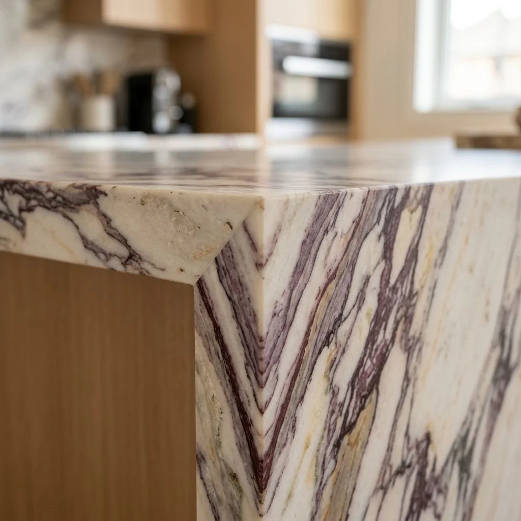
Honed Calacatta Viola marble kitchen island corner featuring a seamless 45-degree miter joint.
Where the Seam Falls
Every fabricator places a seam somewhere, on purpose or by accident. A shop that's cut its share of miters and waterfall edges can point to it without pausing, because they planned it there before the stone was ever cut. A shop that hedges when you ask is telling you something real: the Anchor you pictured and the one they can actually build aren't quite the same object.
I look at that seam longer than most clients think is reasonable. It's the one place on the whole island where the illusion could fail, which makes it the one place worth caring about most.
This isn't a piece with one place to send you. A mitered slab and a bookmatched cabinetry face come out of entirely different corners of the trade, a stone yard on one side, a mill or cabinet shop on the other. What matters more than the channel is whether whoever you're standing in front of has actually cut the joint before, not just quoted it.
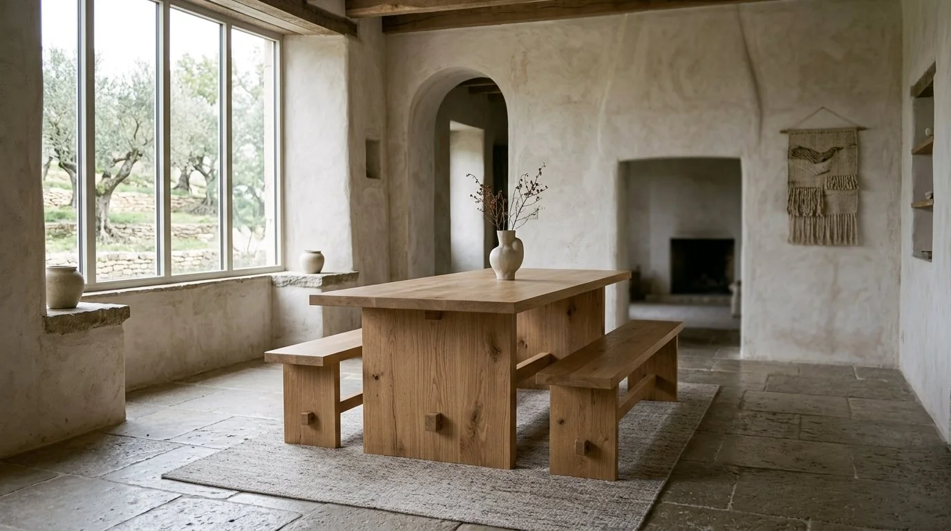
The Weight of Wood
In a world of veneers and cardboard, the weight of solid wood is the ultimate signal of intent. True luxury isn't a look you buy, it’s a density you feel. Explore the intellectual soul of walnut and the architectural strength of white oak in the modern home.
The easiest way to spot a fake table has nothing to do with how it looks. Tap a ring against solid walnut and you get a low, dull knock, the sound of mass absorbing the hit. Tap the same ring against three layers of walnut veneer glued to particleboard and you get a rattle. That's the sound of a table that's mostly air and glue underneath a photograph of wood.
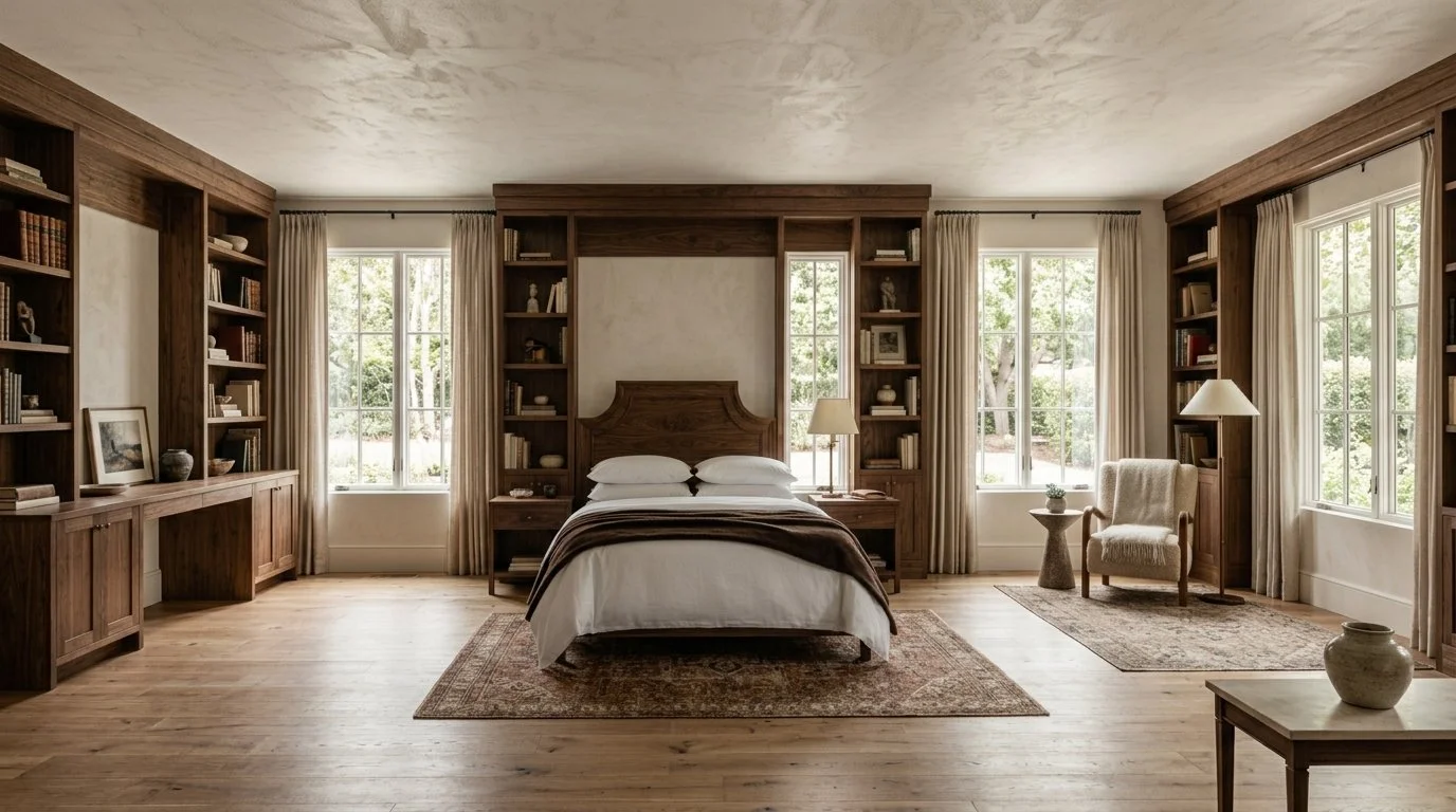
A spacious bedroom anchored by a custom walnut bed frame and surrounding millwork, and crisp white linens and a chocolate brown cashmere throw.
Walnut Doesn't Age Like the Others
American black walnut runs about 1,010 on the Janka hardness scale, which puts it on the softer end of hardwoods used in furniture. That's not a flaw. It's why walnut carves and steam bends so cleanly, and why it's been the wood of choice for gunstocks and violin backs for two centuries.
The real reason people fall for walnut is color, and the color does something almost no other wood does. Most furniture grade species, oak, cherry, maple, darken as they age. Walnut goes the other way. Fresh heartwood reads as deep chocolate brown, occasionally shading into a near purplish black, and years of light exposure pull it lighter, toward a warmer honeyed brown. A walnut desk built forty years ago isn't darker than the day it was made. It's mellowed.
Nearly three quarters of the black walnut cut in this country comes out of the central states, Missouri, Kansas, Iowa, where it's common enough to be Iowa's state tree. I look for boards from that region specifically, straight grained, with the occasional curl or burl left in rather than sanded into uniformity. Walnut is a library wood. It belongs where a room is meant for thinking, not performing.
Why White Oak Reads as Structure
White oak sits at roughly 1,350 to 1,360 on the Janka scale, about 350 points harder than walnut, and that density is the whole point. This is the wood you build a table for a family that actually uses it.
Cut it quarter sawn and white oak does something walnut can't. Every species has ray cells running radially through the trunk, but white oak's are the largest of any domestic hardwood, and sawing it on the quarter exposes them as a rippling fleck pattern across the board face, sometimes called tiger stripe. It's not a finish effect. It's the tree's own structure showing through.
There's a second reason white oak has outlasted trends for so long, and it has nothing to do with looks. Its pores are filled with a substance called tyloses, which blocks water and air from moving through the wood. It's the same property that made white oak the standard for whiskey barrels and wooden ship hulls for three hundred years. A dining table doesn't need to hold bourbon, but the same density that keeps a barrel from leaking is why an oak trestle table shrugs off a spilled glass of wine without swelling or staining.
Light oak dining table with matching wooden benches on a rough stone floor, set against limewashed walls with a large window.
What a Veneer Can't Do
A veneer is a slice of real wood, sometimes as thin as a fortieth of an inch, glued to a substrate of MDF or particleboard. Manufacturers call this "stable," and dimensionally it often is. But stability isn't the same thing as durability.
Solid wood works differently. If a walnut tabletop takes a scratch during a dinner party, that mark sands and oils out, and the table gets refinished, not replaced. That's the actual argument for solid construction. It isn't that veneer looks worse on day one. It's that solid wood is the only version of the two that can be repaired at all.
The Only Question Worth Asking Before You Spec It
Before I spec anything in walnut or white oak, whether that means a trade showroom or a call to the mill, I ask one question: does the grain go all the way through, or does it stop an eighth of an inch down? The price matters less than that answer. So does the finish, and so does whatever you're told about either one.
Choosing solid wood isn't about nostalgia for how furniture used to be made. It's a practical bet that a table built to be repaired will outlast one built to be replaced, and that the house you're building deserves furniture that can actually keep up with it.
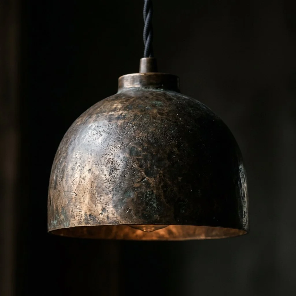
Not Every Room Deserves a Chandelier
Statement lighting is the final note in a room’s composition. Explore the Madison Prime standard for selecting fixtures with architectural scale and material depth.
Most statement fixtures in expensive houses are the wrong size. Not cheap, not ugly, just off by a few inches in a way nobody in the room can name. The homeowner blames the room. The room was never the problem.
Getting it right isn't a matter of taste. It's a small set of numbers, checked against the actual space, before style gets an opinion.
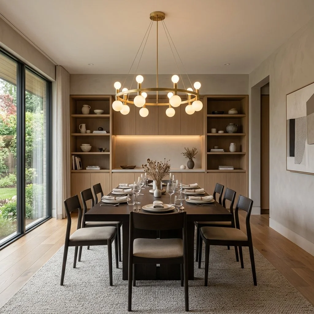
Dining room featuring a round brass chandelier centered directly above a dark rectangular dining table.
Sizing to the Room, Then to the Table
The starting formula is almost insultingly simple. Add the room's length and width in feet, and that sum in inches is roughly the fixture diameter to aim for. A room that measures twelve by fourteen feet points to a chandelier around twenty six inches across. It's a floor, not a verdict, and ceiling height and fixture density push it up or down from there, along with how ornate or spare the design itself reads up close.
Over a table, the room formula stops mattering and the table takes over. The fixture should run somewhere between half and two thirds of the table's width, narrower for round tables, and once it climbs past three quarters it starts crowding the chairs at either end. A four foot table wants a fixture in the twenty four to thirty two inch range, not a number borrowed from the room it sits in, the way I'd size a piece for a table discussed in The Centered Table.
Hanging It at the Right Height
Getting the diameter right and then hanging it wrong undoes all of it. Over a table, thirty to thirty six inches between the bottom of the fixture and the tabletop is the standard for an eight foot ceiling, with roughly three more inches of clearance added for every foot the ceiling gains beyond that. In a foyer or hallway, where people walk directly beneath the piece rather than sitting under it, the bottom of the fixture needs at least seven feet of clearance from the floor, full stop, regardless of how good it looks lower.
Speaking the Room's Material Language
Scale solved, the fixture still has to agree with the room it's in. A brass pendant, slim and unadorned, in a room built on straight lines and minimal trim reads as considered. Drop the same pendant into a room already carrying carved millwork and a heavier hand throughout, and it looks like it wandered in from a different house. The fixture doesn't need to match every other metal finish in the room. It needs to agree with the room's actual weight, ornate or restrained, and say so honestly rather than splitting the difference.
The Case for a Living Finish
Bronze and brass earn their place here because they're chemically alive, not because they look expensive. A hand applied patina isn't paint. It's an oxidizing agent set loose on the metal and allowed to react, which means no two fixtures finish identically even off the same production run, and the surface keeps shifting slightly for as long as the piece is in the house. Left alone it can dull. A little wax every so often is what keeps the color from going flat, and that small bit of upkeep is part of what a real finish costs, not a flaw in it.
Single bronze pendant light fixture with a naturally patinated surface.
One Point Inside a Larger Plan
A statement fixture that ignores everything else in the room stops working the moment it's switched on alone. A dining fixture still has to throw a soft, even glow across the table it hangs over. An entry fixture still has to get someone from the front door into the house without a hard edge of brightness in between. None of that changes because the fixture is also the room's focal point. The showpiece has to fit inside it.
Let the Room Ask First
Every rule here runs the same direction: the room decides, then the fixture answers. Start with the room's own math, not with what looks good in a showroom. The table narrows the diameter if there's a table involved. The ceiling sets the height, no matter how good the fixture looks lower. Material comes last, once both of those are settled. A beautiful chandelier hung by guesswork in a room that never asked for it just sits there being expensive. The right one looks like the room couldn't have worked without it.

The Geometry of Light
Discover the Madison Prime principles of strategic lighting placement. Learn how to balance function and beauty through architectural lighting geometry.
A shadow cutting across the top of a painting tells me the fixture was switched on, never actually aimed. A bedside lamp that blinds instead of glows tells me it was guessed at, never measured. Both come from the same mistake: treating placement as an afterthought to the fixture itself, when it's the whole decision.
Move an accent fixture from twelve inches off a wall to thirty, and the wall changes character completely. Close in, aimed at a narrow angle, the light rakes across stone or plaster and turns every ridge into a shadow. Pulled back and widened, that same beam smooths the surface into an even, unbroken wash. Same wall, same bulb. The eighteen inches in between decided everything.
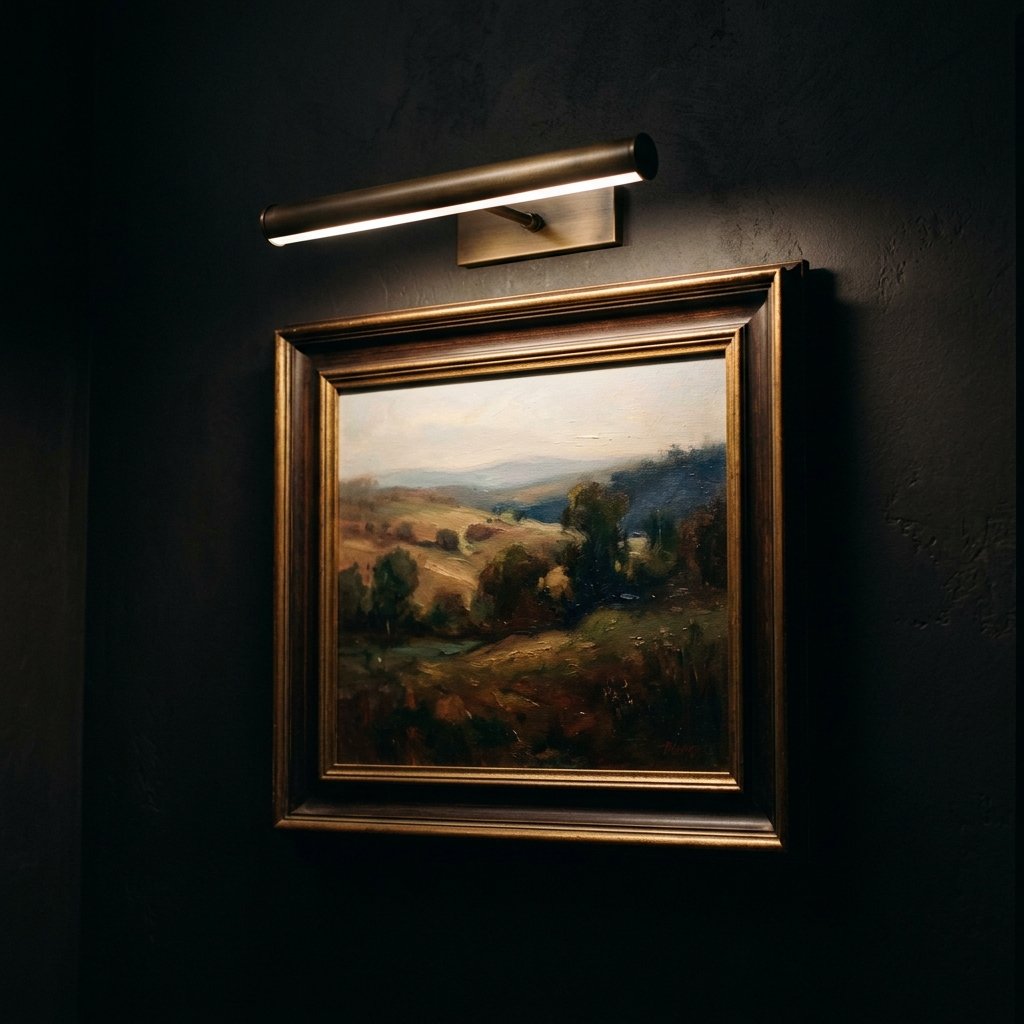
Aged brass picture light mounted on a dark wall casts a soft, warm glow downward across a framed painting.
Finding the Point Worth Lighting
Effective accent light runs three to five times brighter than the ambient level around it. That contrast, not the fixture itself, is what tells the eye where to look. Undershoot the ratio and the highlighted piece disappears back into the room. Overshoot it and the piece reads as spotlit rather than considered, more showroom than home.
For a painting or a piece of sculpture, angle matters as much as intensity. A picture light aimed at roughly 30 degrees off vertical lights the surface evenly and keeps the beam from bouncing straight back into the room as glare off glass or varnish. Steeper than that and the top of the frame goes dark. Flatter and the reflection lands exactly where a viewer would stand to look at it.
Building Height Into the Room
A room lit from one point never feels finished, no matter how good that point is. Cinematographers solved this generations ago, not with one dominant light but with sources set at different heights and angles that work against each other on purpose. Residential lighting borrows the same logic without the vocabulary: a floor lamp at knee height and a sconce aimed at art or millwork at shoulder height put light into a room from different elevations than an overhead fixture ever will. Light entering a room from several elevations reads as depth to the eye. One central fixture, however handsome, flattens everything beneath it into the same plane.
Skimming a Surface Versus Smoothing It
Grazing and washing get confused constantly because they use the same equipment aimed differently. Grazing places the fixture close, six to twelve inches off the wall, with a narrow beam of fifteen to twenty five degrees. At that distance and angle, light rakes across the surface and throws shadow into every imperfection, which is exactly the point on rough plaster, stacked stone, or reclaimed wood. Washing pulls the same fixture back to two or three feet and widens the beam to forty or sixty degrees, and the shadows disappear. What's left is even coverage, the right choice for a smooth wall meant to read as a backdrop rather than a surface with texture of its own. Choosing between the two isn't really a style decision. It's a measurement.
The Sanctuary Standard
Nowhere does placement matter more than beside a bed. A sconce mounted at the standard living room height of five feet off the floor sits nowhere near where a reader's shoulder actually ends up once they're propped against pillows. The number that works instead is measured from the mattress, not the floor: thirty to thirty six inches above the mattress top, six to twelve inches out from its edge. That range puts the light source above shoulder height when sitting up, low enough to fall across a page, and out of the sightline when lying back down to sleep. Get it right and nobody notices the sconce is there. Get it wrong and either the bulb stares back at whoever is trying to sleep, or the light never quite reaches the book.
An articulating brass sconce casts soft downward light over a crisp linen bed.
The Planning Sequence
None of this gets decided fixture by fixture in a showroom. It starts with mapping what each zone in a room is actually for before a single light gets chosen, then layering the three tones described in The Composition of Light with intention instead of symmetry. A dining table and a reading chair eight feet apart rarely need identical treatment, even inside the same room. The last check is simpler than either of those: stand in the doorway with everything switched on and ask whether the room still has somewhere for the eye to rest, or whether every surface is doing something at once.
Measure First, Buy Second
A house full of beautiful fixtures can still feel wrong if none of them sit where the room actually needs them. I'd rather walk a room with a tape measure than a catalog. The distance off a wall, the angle off vertical: that's what turns good equipment into a room that works. Buy the fixture last.
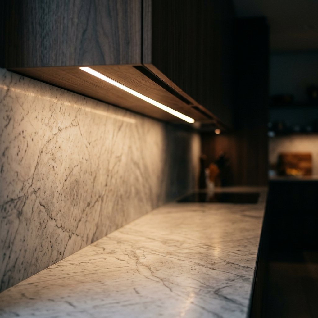
The Composition of Light
Lighting is more than illumination; it is the creation of depth. Explore the composition of light, from the foundation of ambient glow to the subtle drama of accents.
I think about a room's lighting as three separate jobs, not three versions of the same fixture. Confuse the jobs and you get a space that's either flat and shadowless or, worse, unevenly lit in a way nobody can quite name. Get them right and the room reads as put together, not stitched together, layer by layer.
A kitchen island needs about 50 footcandles of light to chop something safely. The armchair eight feet away needs a fifth of that. Most rooms treat every corner the same, and the eye can always tell.
Recessed LED strip under a dark wooden cabinet, illuminating the rich veining of a honed marble countertop with warm, even light.
The Baseline: Ambient Light
Ambient is the light that establishes what the room looks like before anyone does anything in it. It should sit low and even, somewhere in the 10 to 20 footcandle range for a living room or bedroom, which is genuinely dim compared to a kitchen, where the IES recommends 30 to 40 footcandles just for general coverage. That's dim enough to see the room by, not read fine print in it.
Color temperature matters more here than anywhere else, because ambient is the light every other layer gets judged against. Most residential interiors land between 2700K and 3000K, warm enough to flatter skin and wood without tipping into the amber cast of pure candlelight. Recessed architectural downlights do this job well, and so does cove lighting run above crown detail. Either one needs to sit on a dimmable circuit, or the fixed level becomes a mistake in a room that's used for both dinner parties and Tuesday mornings.
The Layer That Gets Requested: Task Light
Task is the layer clients actually notice missing, usually the first time they try to read in a chair or chop something on an island lit only from above. The IES puts kitchen prep surfaces at 50 to 100 footcandles and reading areas at 20 to 50, both well above ambient levels, which is the whole point.
This is also where decorative choices fail on function. A pendant scaled for looks over an island frequently doesn't put out enough lumens to actually do task work, which is a real and common design error, not a matter of taste. Linear LED strips run under cabinets solve counter work without adding visual clutter, and a gooseneck or articulating lamp does more for a reading chair than a second ambient fixture ever will. The test for any task fixture is simple: does it hit the number at the surface where the work happens, not just brighten the general area.
Accent, Used With Restraint
Accent is the layer with the least amount of light and the most amount of judgment involved in placing it. Its job is to direct attention toward something specific, a run of millwork or a single piece of art, and it fails the moment it starts competing with task or ambient instead of pointing toward something.
Color rendering index matters more here than brightness. A high CRI source, generally 90 or above, is what lets a picture light show a canvas's actual pigment instead of a washed-out approximation, and what lets an uplight run at low voltage reveal real texture in a stone wall instead of flattening it. Picture lights belong in this layer. So do hidden uplights run along vertical texture, and an occasional structural wall sconce. What doesn't belong is treating accent as a second ambient source; if it's making the room brighter, it's doing the wrong job.
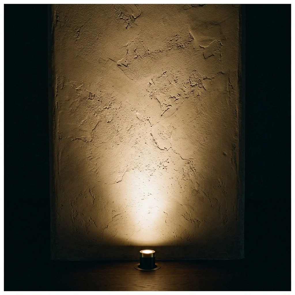
Small in ground uplight casting warm, grazing illumination up a heavily textured plaster wall surrounded by deep shadow.
Keeping the Numbers Honest Across the Room
Mismatched temperature between otherwise fine layers is the most common failure I see, more often than an actual missing layer. A 2700K recessed can next to a 4000K strip under the cabinet reads as wrong even to someone who couldn't tell you why. Manufacturers who build for professional specification, USAI is one real example, sell entire product platforms locked to a single static Kelvin option across every fixture type, precisely so a designer can hold 2700K or 3000K constant on the recessed can, the task strip, and the accent sconce alike, without hunting for matching bulbs later. That consistency is a spec decision, made once, at the start of a lighting plan, not something fixed after the fact with warmer bulbs in one lamp.
Ask for the Number
None of this requires more fixtures or a bigger budget. It requires knowing what number a surface is supposed to hit and checking that the Kelvin rating is the same across every layer in the room. That onion still needs its 50 footcandles. The chair next to it still only needs ten.